From Lessons to Conversations - A Language Learning Platform Built for Real Life
Many language learners make progress in theory but struggle to translate it into real conversation. As the Product Designer on BeLingual, I shaped a platform around conversation, collaboration, and peer connection rather than passive study. This led to the Peer Chat feature, which has the potential to improve language retention and build a genuine sense of community between learners.
Design Process
I followed the Double Diamond process for this project as its framework of broadening my understanding before committing to a direction ensured that the solution was shaped by what students actually needed, rather than what I assumed would work for them.
Discover
Market Research
Insight: The competitor analysis revealed that most platforms prioritise structured or AI-led learning over real conversation, with peer interaction rarely featuring as a core part of the experience. Community elements were also found to be common but surface-level.
Design Decision: This highlighted a clear gap in the market, which directed me to position peer-to-peer conversation as a central feature rather than an afterthought. It also lead me to consider connection and accountability as part of the core experience rather than treating it as an add-on.
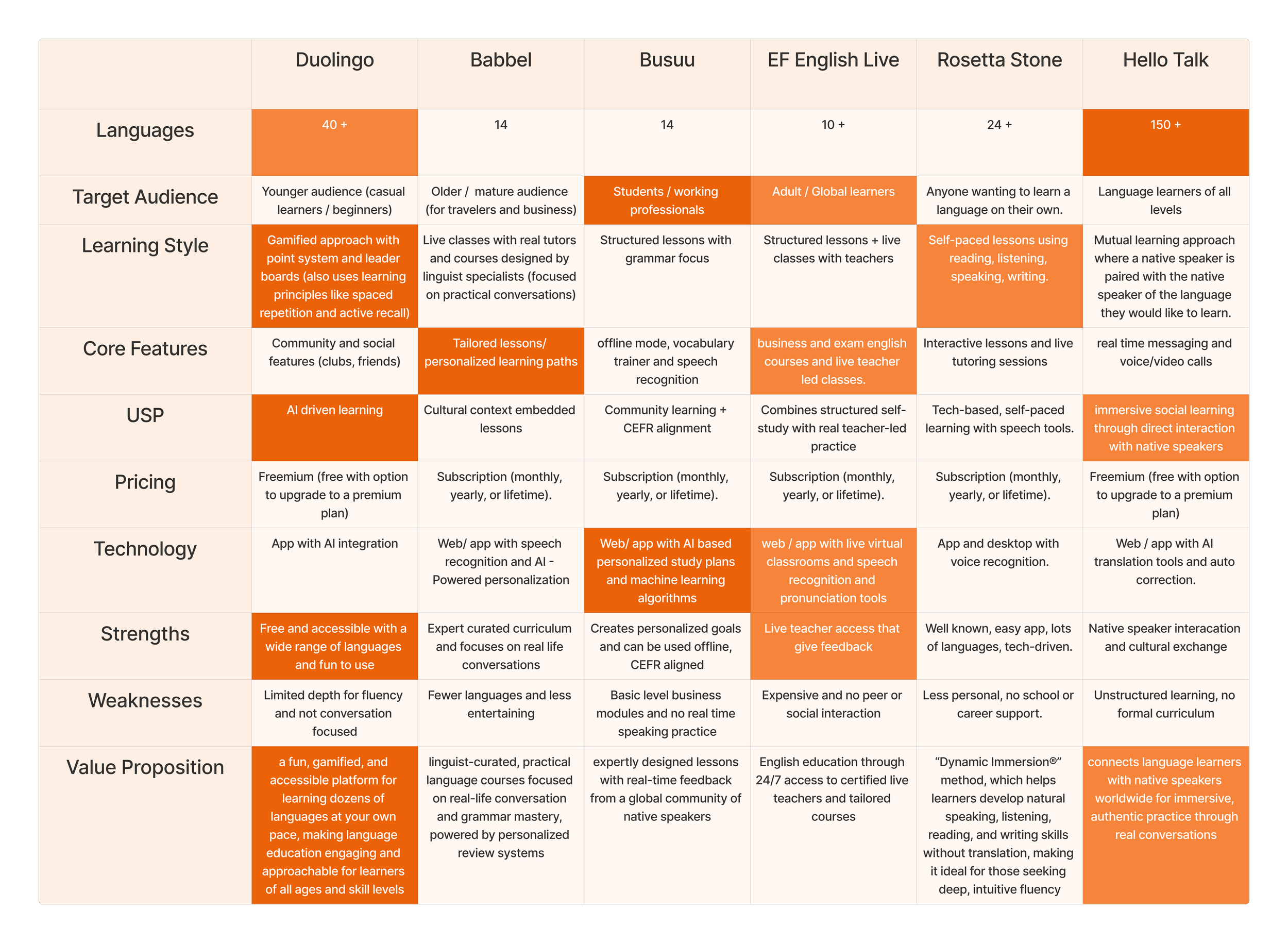
*Competitor Analysis*
Stakeholder Interview
The stakeholder interview revealed that while the business had ambitions to grow into a B2B model, keeping students at the centre remained a core priority. Key objectives centred on making the platform more personal and interactive, and fostering genuine community and real relationships between students. This shaped my focus moving forward, prioritising community-driven design and peer connection as the foundation of the experience, with success measured by student engagement and improved language retention rates.
Stakeholder Objectives:
To grow into a B2B whiles keeping students at the centre
Making the platform more personal, interactive and different from competitors.
To foster community and real relationships between students
Success Metrics:
Increased student engagement, particularly in peer-to-peer conversations and community interactions.
Improved retention rates, with students consistently returning to practice even outside of structured learning times.
Define
Affinity Map
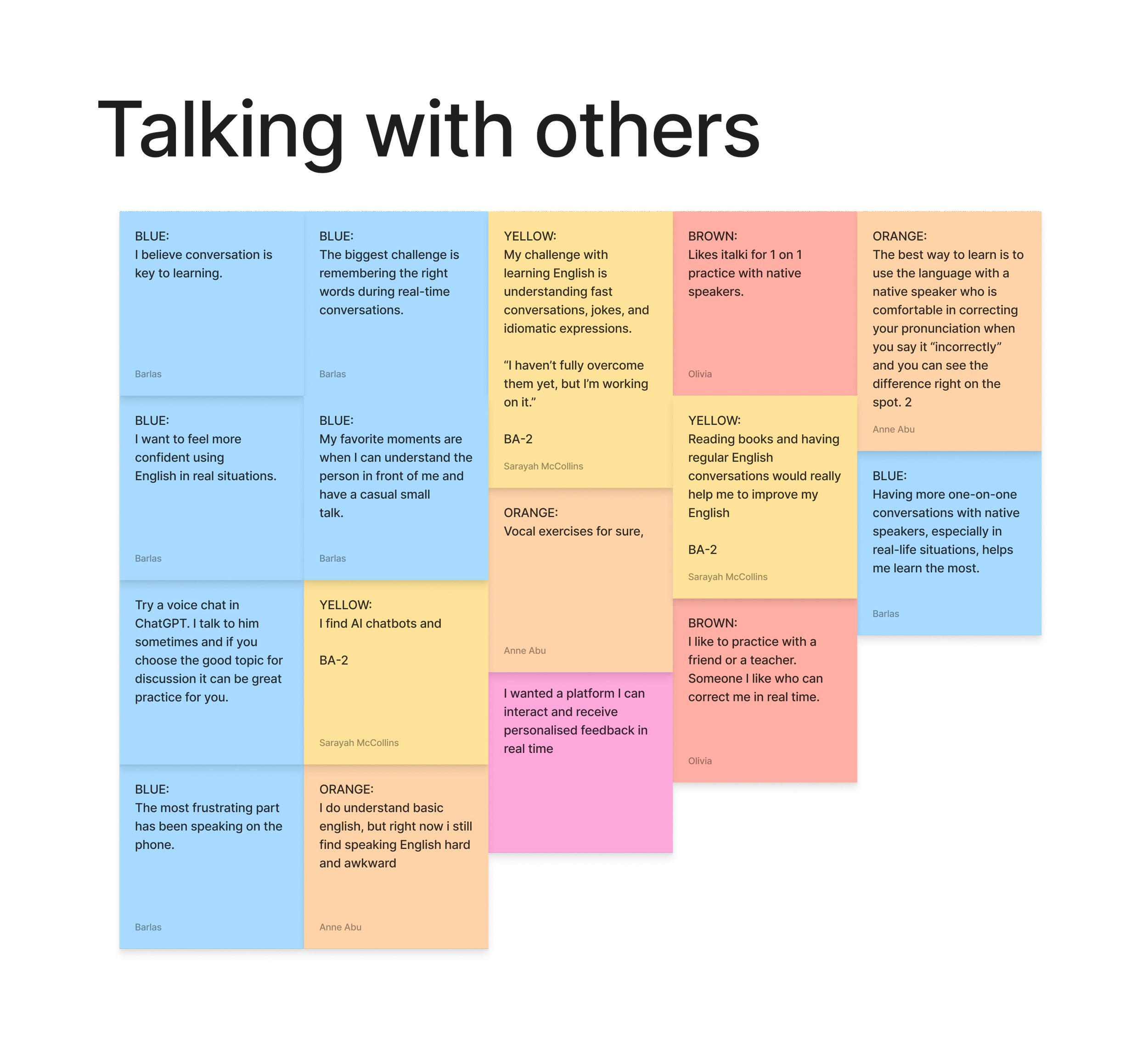
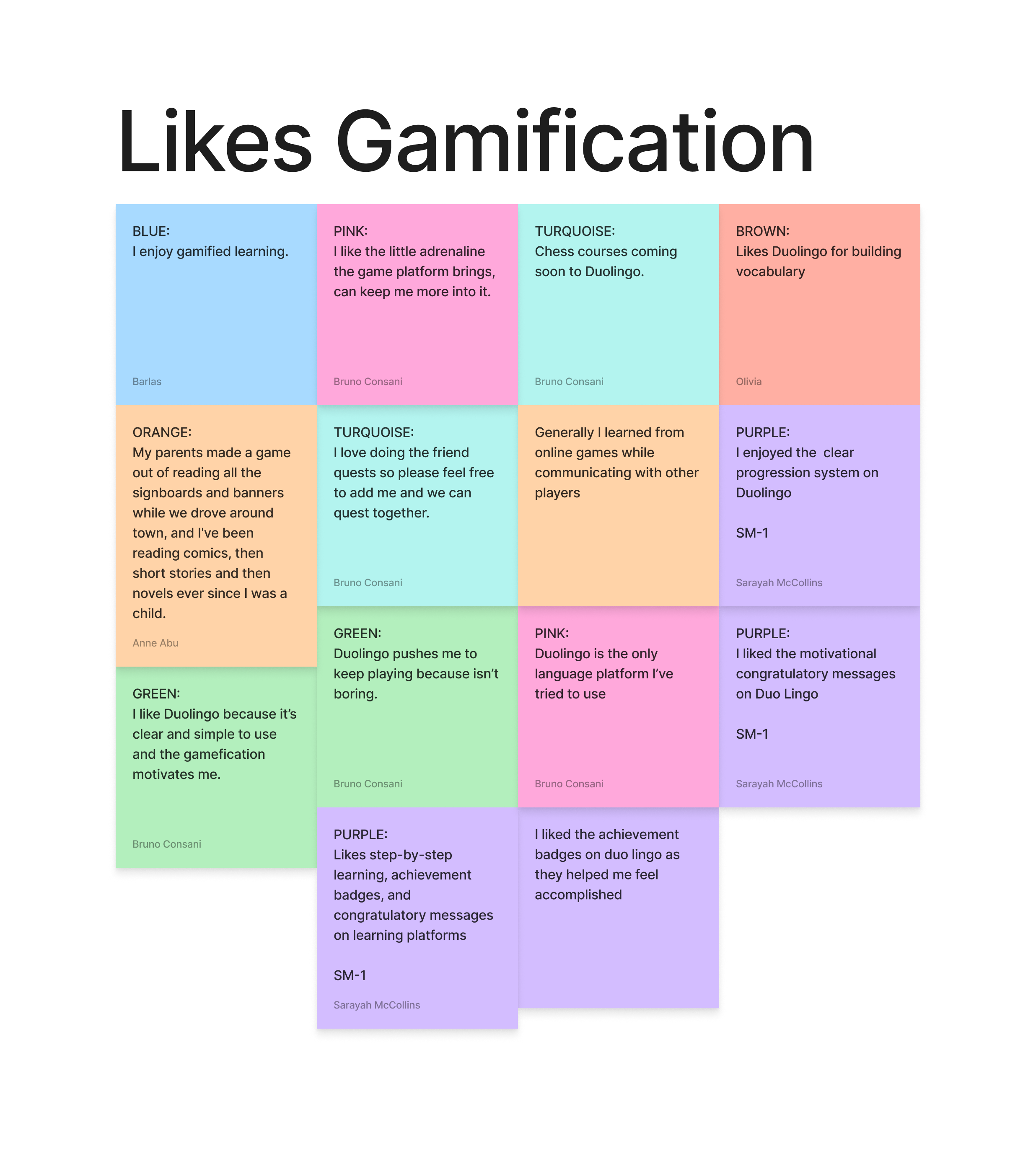
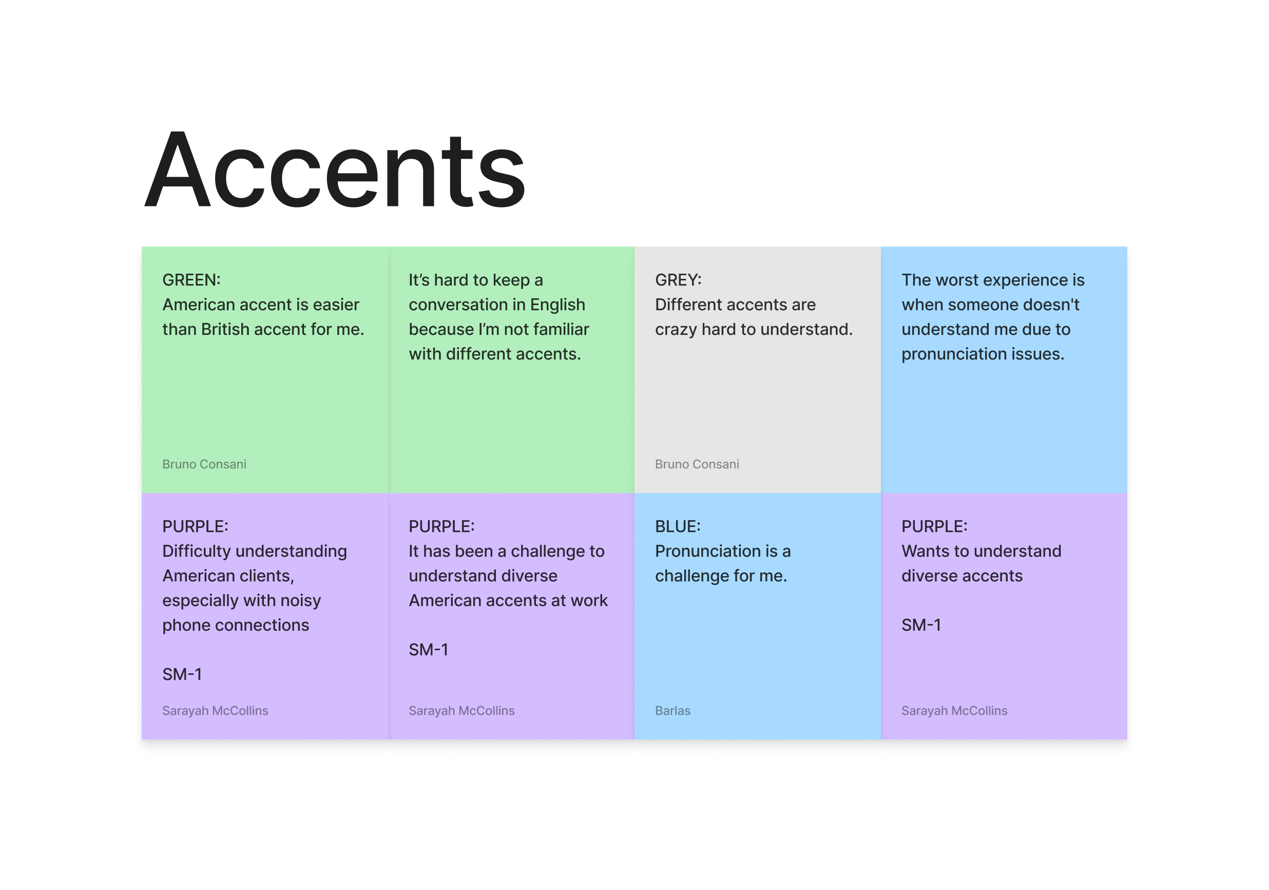
User interviews generated a lot of responses, and affinity mapping the findings helped me identify the common themes and bring the student perspective into sharp focus.
Insight: While gamified learning models were appreciated for keeping students consistent, users found that what they learned rarely translated into real conversation. Without real-life context, apps felt disconnected from practical use, and even when vocabulary and grammar were understood, students still struggled with different accents in natural dialogue.
Design Decision: This pushed me to move away from designing around structured exercises and focus instead on creating space for authentic, unscripted interactions.
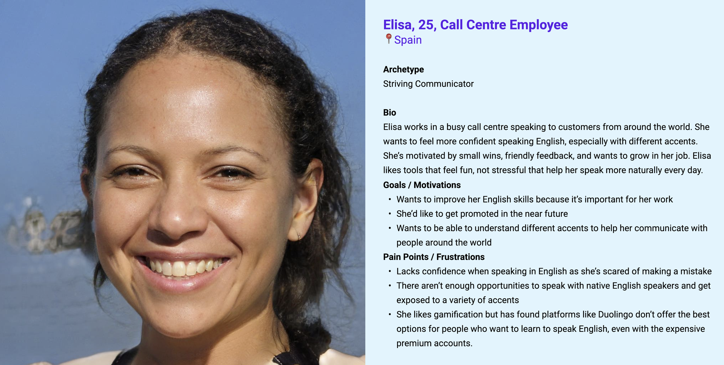
Persona
Insight: For users like Elisa, the frustration was deeply personal, rooted in the inability to apply her learning to real workplace conversations and a lack of exposure to the variety of accents she encountered daily. Existing tools were failing her not because of poor design, but because none of them offered the one thing she actually needed: practice with real people.
Design Decision: This further confirmed that an immersive learning experience that could stimulate real conversations had to be at the heart of the solution.
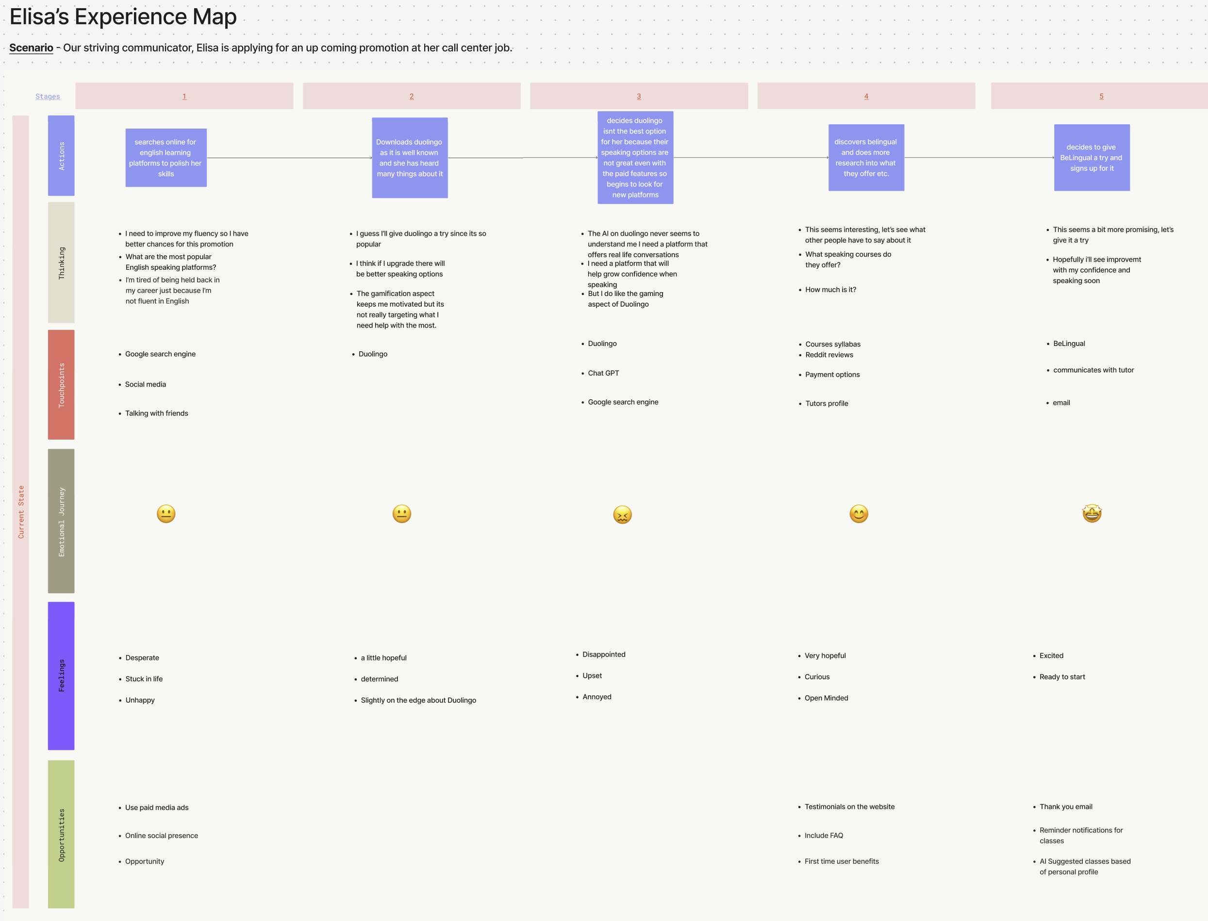
Experience Map
Insight: The Experience Map revealed that user satisfaction dropped most significantly during AI-led speaking practice, highlighting it as the weakest point in the journey. Design Decision: This directly informed my decision to move away from AI interaction and instead prioritise a feature that encourages conversations with real people.
Problem Statement
Elisa, a striving communicator, needs English learning that’s aligned with her workplace communication because general courses don’t help her feel prepared for job-specific situations.
Hypothesis
We believe creating a platform that uses immersive features and the opportunity to learn with native English speakers will equip users like Elisa to communicate better in the workplace and feel confident whiles at work. We will know this when we see better scores in her learning performance and she leaves a good review.
The Solution
Every stage of the research had pointed to the same conclusion: that immersive, real-world practice was what users genuinely needed, and the most effective way to improve language learning. The solution was a peer-to-peer conversation feature that moved students beyond passive learning and into authentic, real-world practice with one another. During ideation workshops, we used Crazy 8s and How Might We statements to brainstorm a range of ideas around peer-to-peer learning, before aligning on the peer chat feature as the most feasible solution to prioritise first, with the strongest potential to scale as the platform grew.
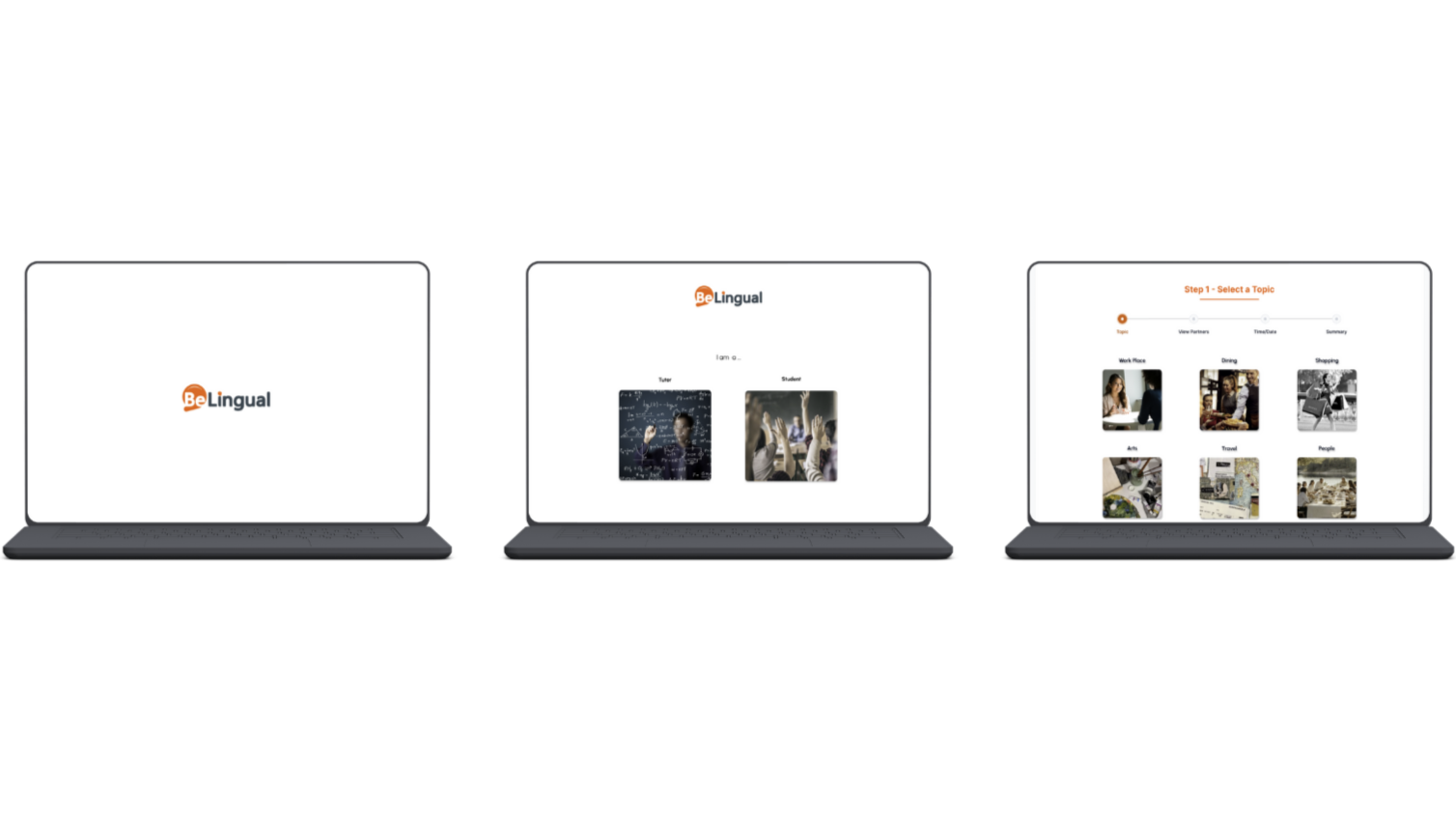
Peer Chat Feature
The purpose of this feature is to facilitate real-life conversations between students outside of scheduled lessons by allowing them to browse other students within the network and schedule a time and date for a call. This feature encouraged students to build friendships while practicing a language they were learning and allowed them to choose conversation topics, though they were free to discuss other subjects as well.
Design Decisions & Trade Offs
From a product perspective, we considered designing an in-built video calling feature to support real-time conversations. However, this introduced significant technical complexity, including the need for reliable video and voice infrastructure, as well as ongoing maintenance and moderation. Given that established platforms like Zoom already solve this effectively, we instead focused on creating a space for students to discover one another and have conversations externally.
Develop
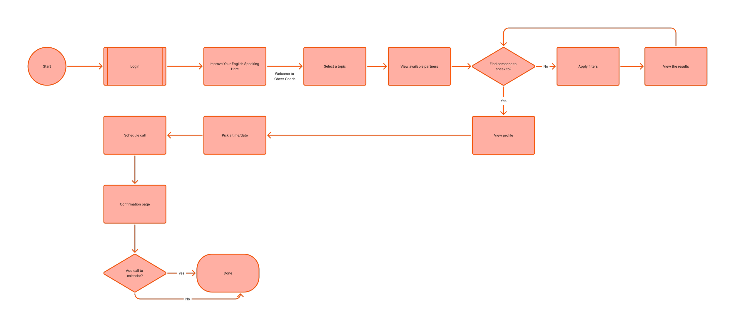
User Flow
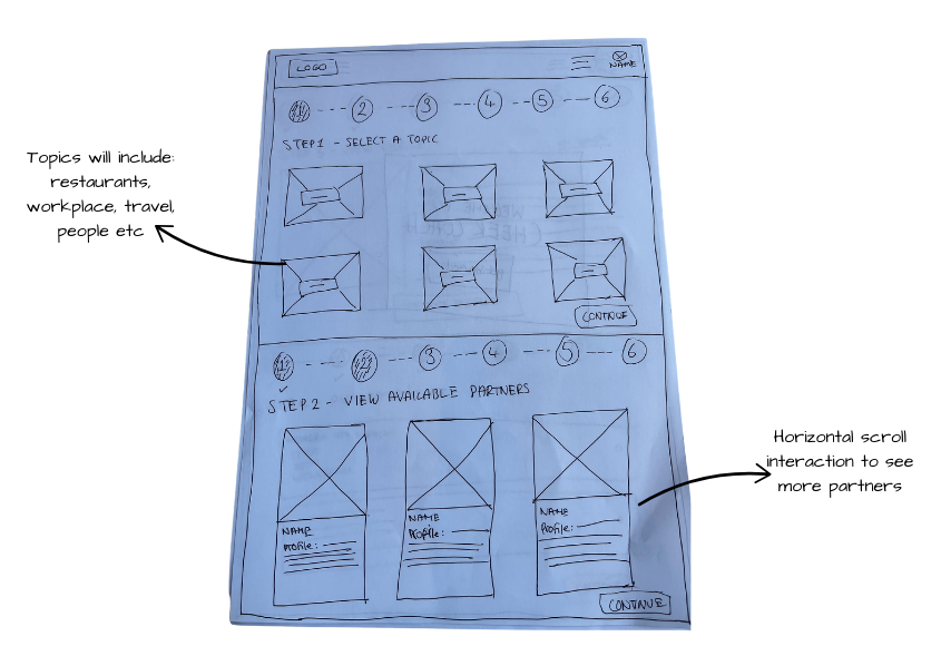
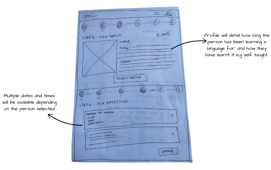
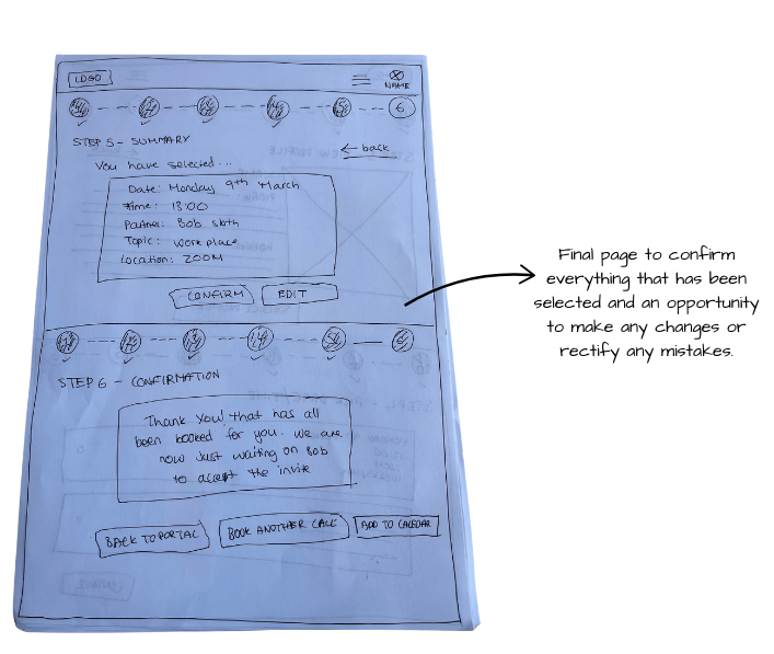
Paper Wireframe
*Peer Chat Feature: Page 1*
*Peer Chat Feature: Page 2*
*Peer Chat Feature: Page 3*
Testing & Iterations
User testing revealed that the meeting creation flow had too many steps and lacked the ability to edit dynamically, forcing users to restart the entire process if an error was made. This informed a redesign of the feature that reduced the number of steps and introduced inline editing, with the aim of improving error recovery and creating a smoother, faster journey overall. To validate these iterations, retesting would focus on task completion time to measure whether users could complete the flow more quickly and with less effort, as well as error recovery rate to assess how successfully users could correct mistakes without abandoning the flow.
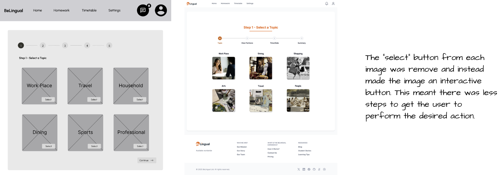
*Peer Chat Feature: Select Topic*

*Peer Chat Feature: View Partners*
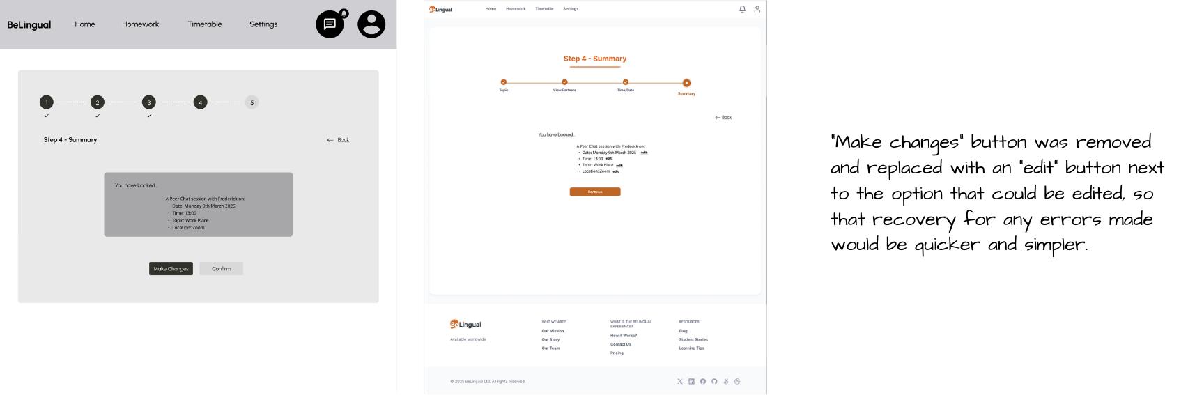
*Peer Chat Feature: Summary*
Deliver
Final Prototype
Reflection
Possible Impact
If launched, the peer chat feature could move students beyond passive learning and into real, confidence-building conversation, directly addressing the gap existing platforms have failed to close. By facilitating peer-led interaction, it would satisfy a core user need for authentic practice while helping students apply their learning to real-world contexts like the workplace. This supports the broader business goal of building genuine community on the platform, with the potential to drive engagement, improve language retention, and position BeLingual as a platform that supports the whole student journey.
What I Would Like To Add
If I were to approach this project again, I would conduct a second round of usability testing to validate the iterations made following initial testing, ensuring the redesigned flows performed as intended before moving further into development. I would also have taken more time to explore a wider range of community-led solutions, such as a forum or discussion board, to assess whether alternative features could have complemented or strengthened the peer chat concept.
Key Takeaways
This project taught me that strong design decisions must be rooted in research and real insights rather than assumptions, something that became clear as every key design decision traced back directly to what users said and experienced. I also learned how to balance business goals, user needs, and technical constraints without losing sight of who the design is ultimately for. Most importantly, it deepened my understanding of what it means to advocate for the user while still respecting the needs of the business and the limits of what is technically possible.
View Next…
Luma
Role: Product designer
Product: Luma is a beauty service booking platform designed to help clients confidently discover, evaluate, and book trusted service providers.
Duration: 2 weeks
Tools: Figma