Booking With Confidence - Redesigning Trust In Beauty Services
Existing beauty booking platforms prioritise speed over trust, leaving users uncertain about provider quality and reliability at the cost of their confidence to book. As the sole designer on Luma, I explored how a booking experience could be reimagined around credibility, transparency, and emotional reassurance rather than availability alone. This shaped every design decision, directing the solution toward a trust-led platform that guided users from uncertainty to confident action.
Design Process
I followed the Double Diamond process for this project as the structured approach of exploring widely before narrowing down meant every design decision was rooted in research rather than assumption, something that mattered greatly given how layered and emotional the problem of trust turned out to be.
Discover
Market Research
Insight: The competitor analysis revealed that complex onboarding reduces booking confidence rather than building it, and that star ratings alone leave users searching for reassurance elsewhere.
Design Decision: Both findings pointed to the same opportunity: a platform that earns trust before asking for commitment and offers more meaningful signals of provider credibility. This became the foundation that shaped Luma's design direction.
As part of my research, I signed up to several existing booking platforms as a consumer to gain a first-hand understanding of the end-to-end user journey and overall experience. Experiencing the onboarding, discovery, and booking flows directly helped me better empathise with users and identify moments of friction, uncertainty, and trust breakdown, I included these findings in the competitor analysis.

*Competitor Analysis Table*
User Research
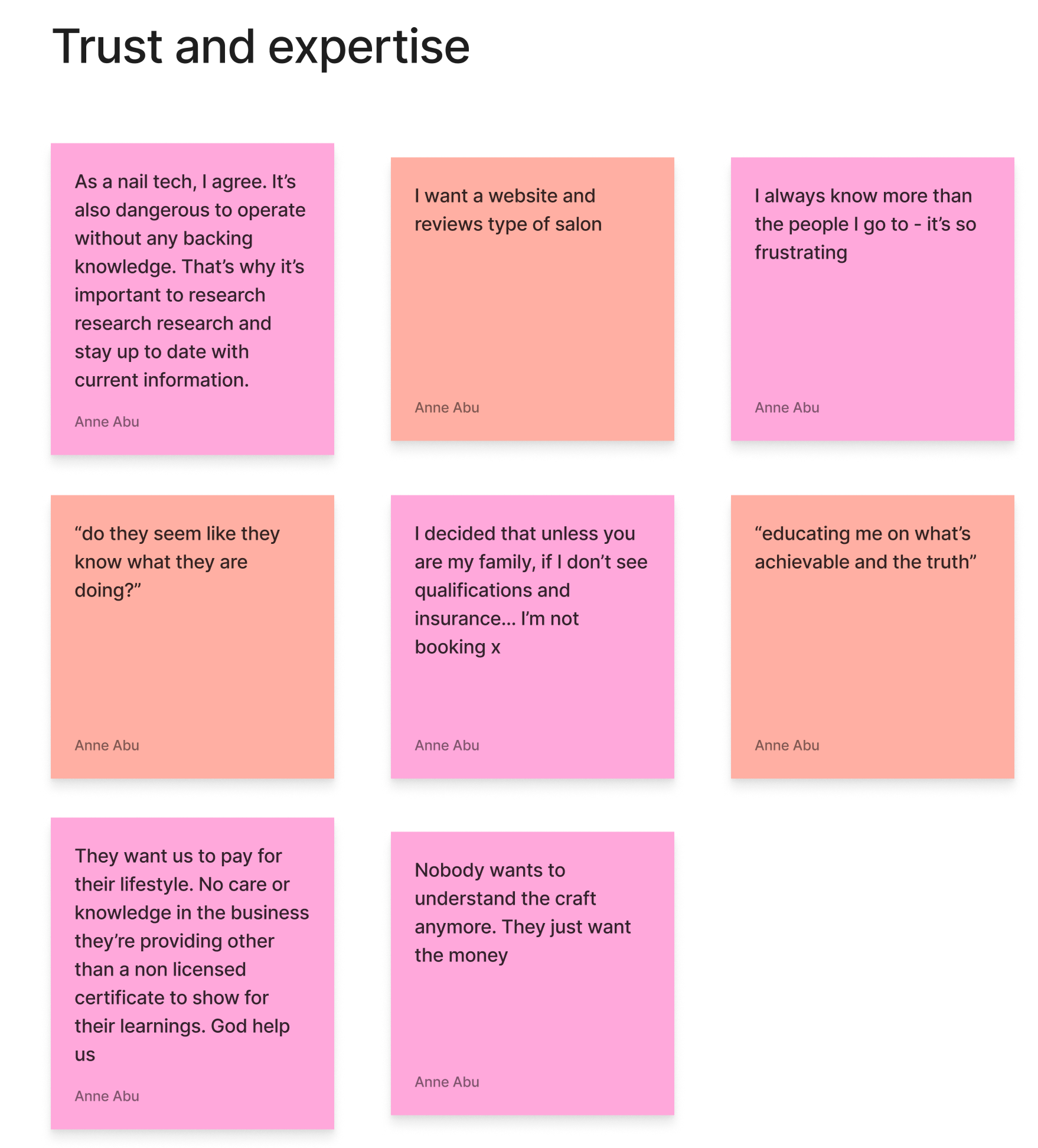
Insight: Social listening across Reddit and TikTok deepened this further, revealing that users weren't just frustrated, they felt let down, at times violated, and increasingly anxious about trusting new service providers.
Design Decision: The emotional weight behind these experiences pointed to a problem that went far deeper than a usability issue, and directed me to ensure that reassurance and trust were not just features but the driving force behind every design decision.
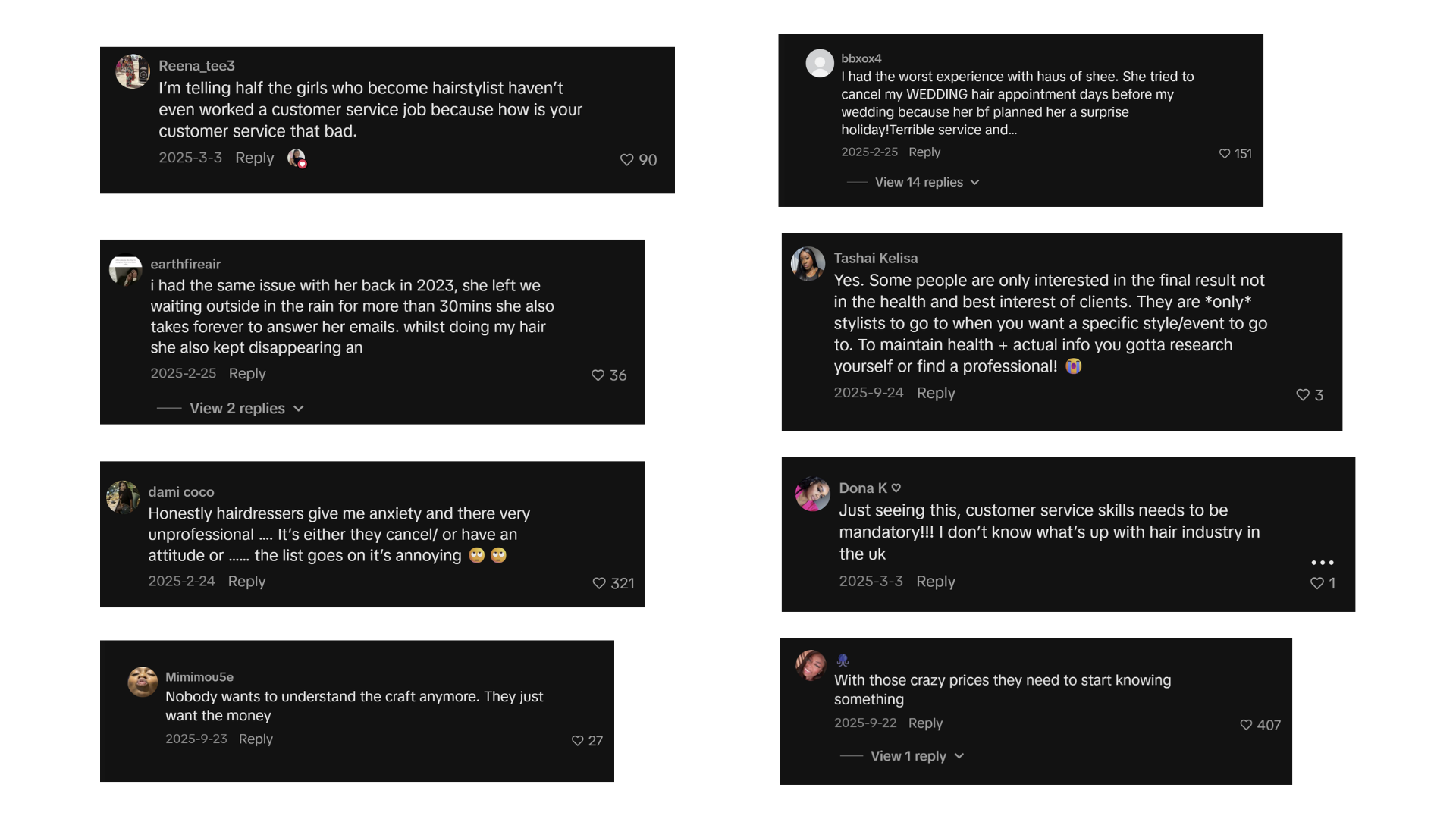
*Social Listening Findings*
While reviewing this content, I focused on answering the following research questions:
Where do you go to find a good hairstylist?
What things do you look for in a hairstylist before booking them?
What are somethings that can put you off booking a hairstylist?
What makes a hairstylist trustworthy?
What part of the booking process feel annoying or stressful?
What do you wish you knew before booking a hairstylist?
Define
Affinity Map
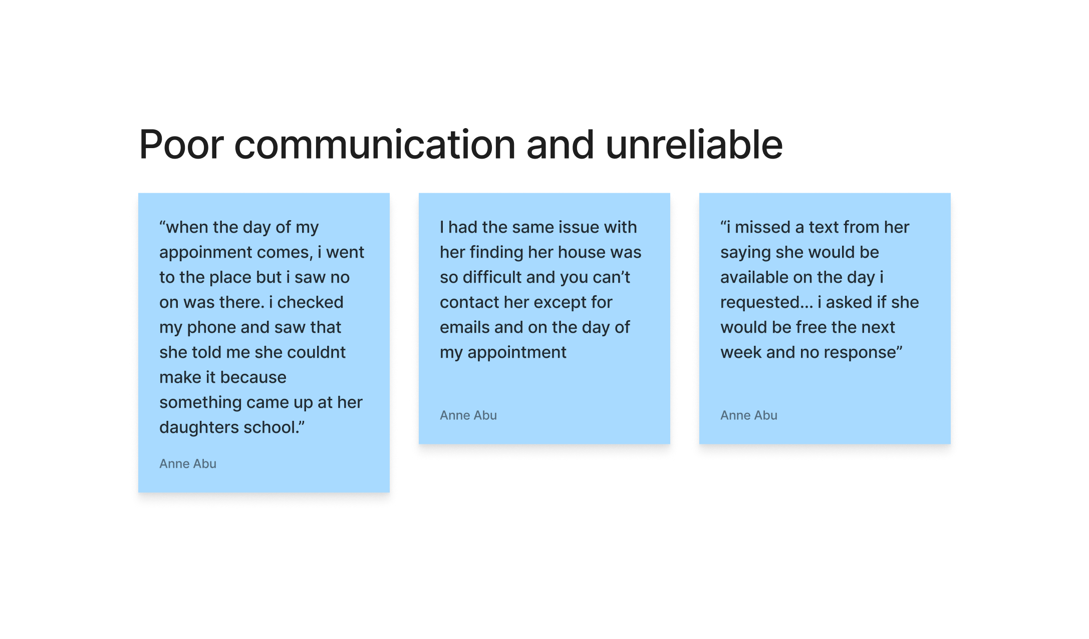
Insight: Affinity mapping the research surfaced two consistent themes: poor communication being interpreted as unreliability, and users actively seeking proof of expertise rather than assuming it. When neither was clearly present, hesitation grew and bookings were often abandoned.
Design Decision: This pushed me to consider not just how to build confidence before a booking, but how to maintain it after, particularly around reducing the anxiety caused by last minute cancellations and post-booking uncertainty.
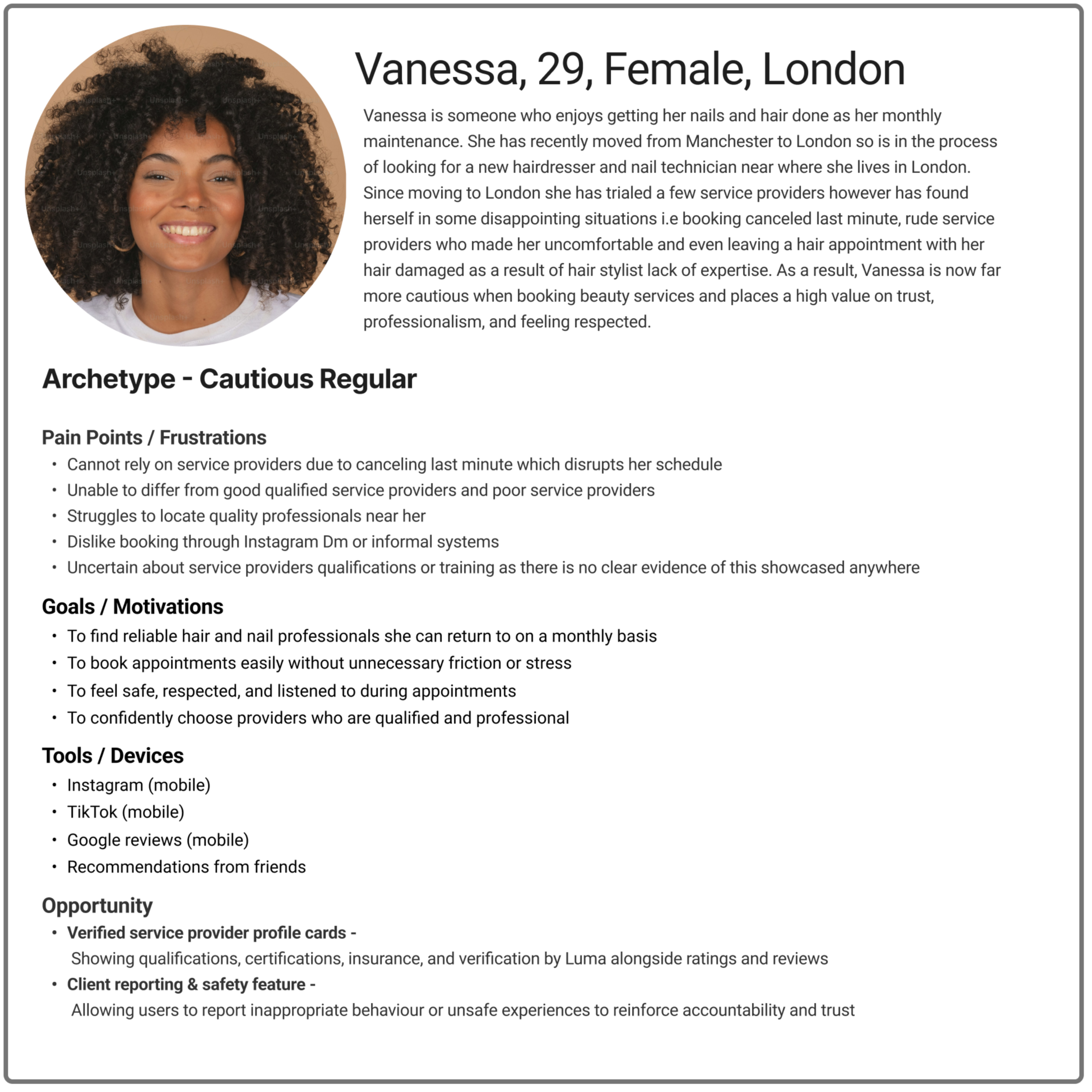
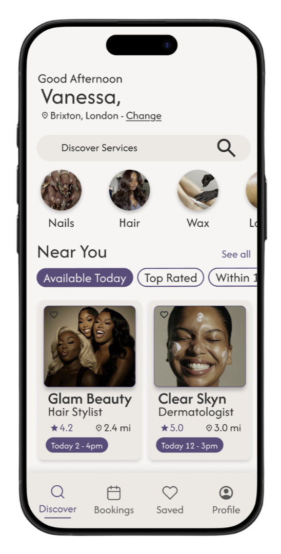
Persona
The persona brought this to life through Vanessa, who couldn't distinguish qualified providers from unqualified ones and had grown increasingly cautious after a series of negative experiences. Her story confirmed that trust was breaking down at multiple points in the journey, reinforcing the need for clearer, verifiable trust signals that worked both before and after a booking was made.
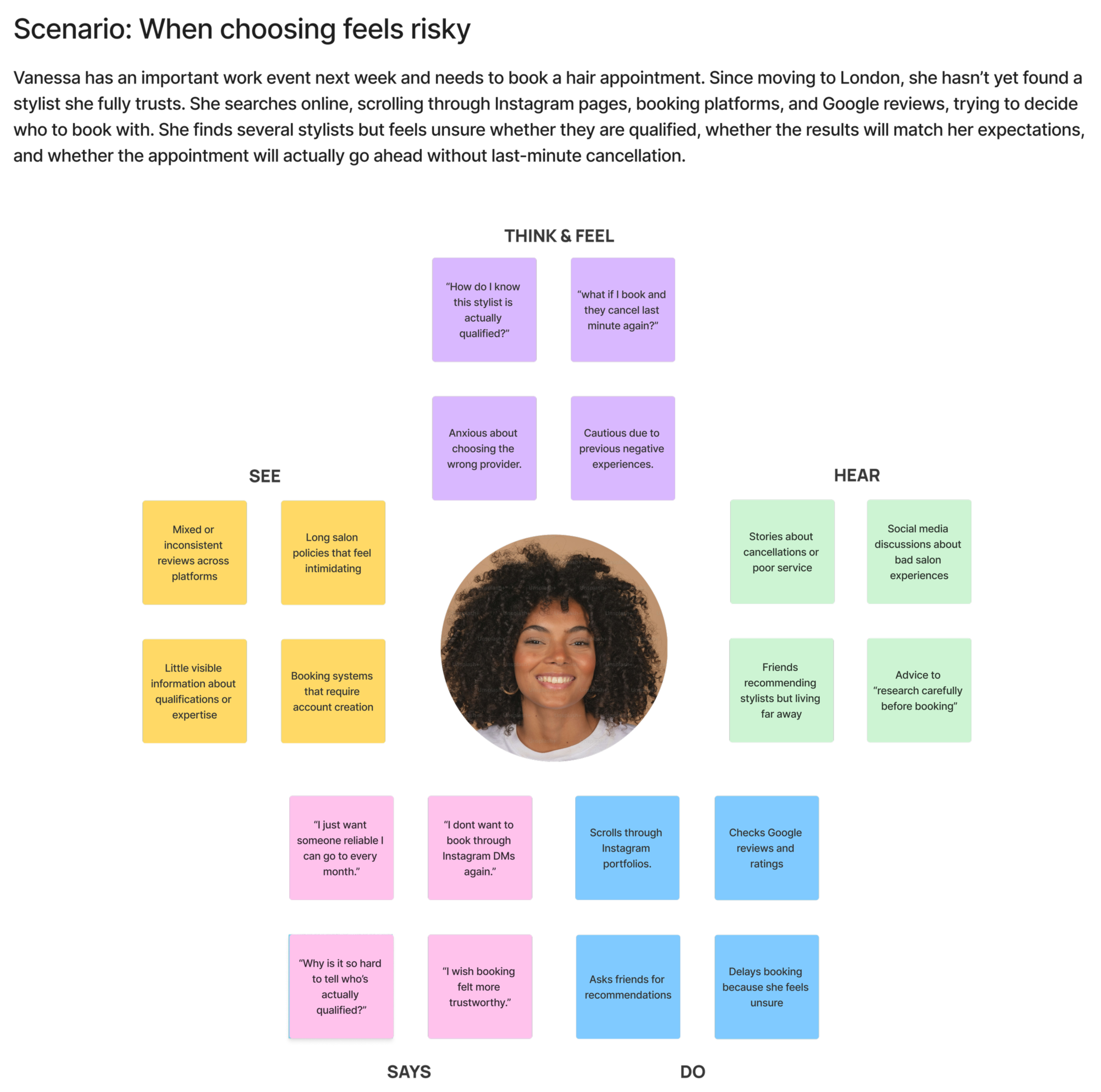
Empathy Map
Insight: The empathy map then revealed just how much work Vanessa was doing on her own to feel confident, cross-referencing Instagram portfolios, Google reviews, and friend recommendations simply to fill the gap the platform wasn't closing.
Design Decision: This directed me toward a feature that would bring all of that together in one place, giving users everything they needed to make a confident decision without jumping between platforms.
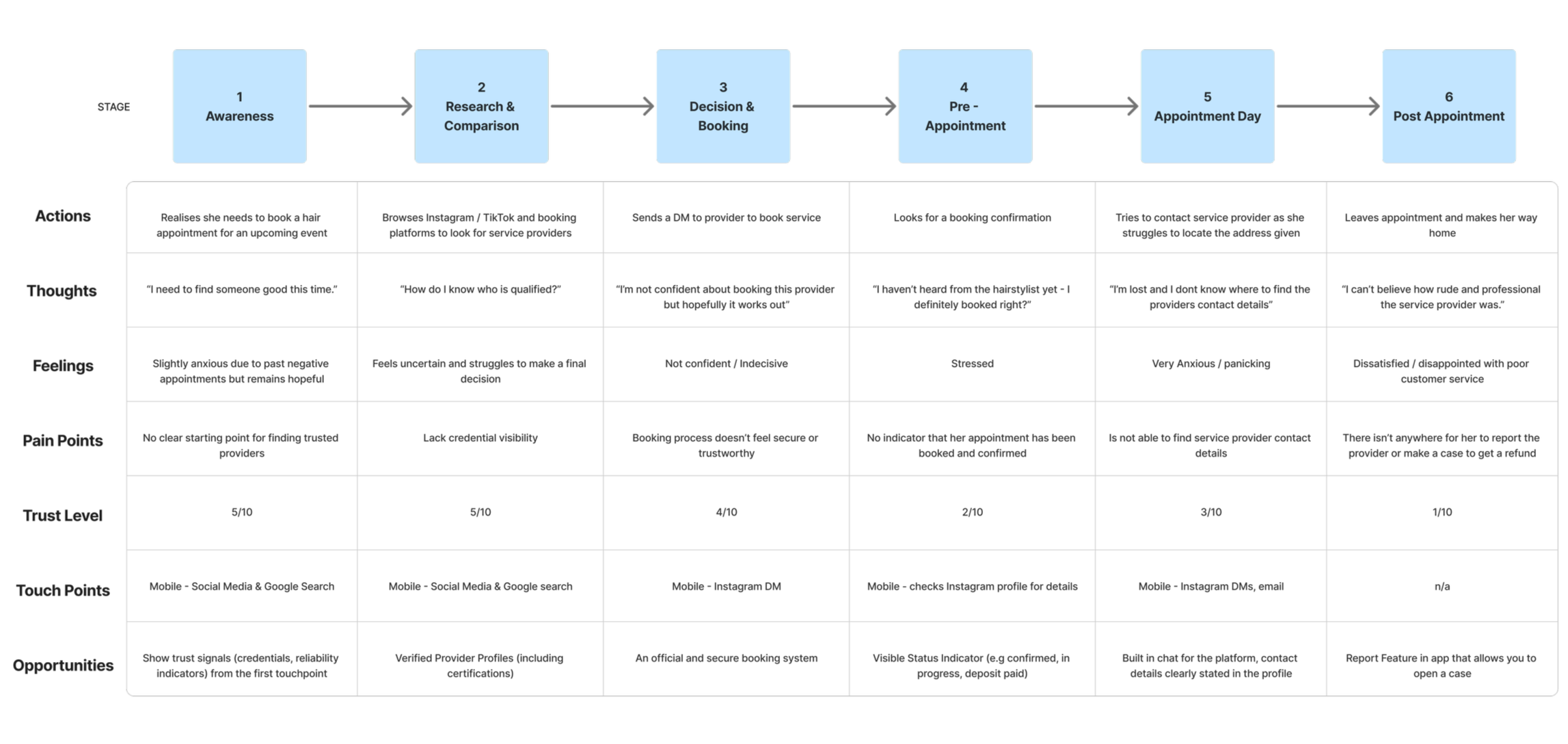
Experience Map
Insight: The experience map brought everything into focus, showing that distrust was setting in even after a booking was made, driven by poor communication and a lack of accountability for providers who let clients down.
Design Decision: This confirmed that Luma needed to provide reassurance across the entire journey, not just at the point of booking, giving users a genuine sense of protection and confidence from discovery all the way through to their appointment.
Problem Statement
Cautious regular clients need a way to confidently identify and book qualified service providers, because users no longer assume provider competence and increasingly look for clear proof of training, certifications, and professionalism before committing to an appointment.
Hypothesis
I believe that clearer trust indicators and stronger post-booking reassurance will increase booking confidence and reduce anxiety throughout the entire journey. I will know this is true when we see an increase in completed bookings, repeat bookings, and overall user retention.
The Solution
Final Design Decisions: Every stage of the research pointed to the same conclusion: users needed a platform that built and maintained confidence across the entire booking journey, not just at the point of discovery. While many potential features were considered, I prioritised the appointment tracking feature and the service provider profile card as the two solutions that most directly addressed the core user needs around trust, transparency, and post-booking reassurance.
Reflection: If I were to revisit the project, I would use a feature prioritisation matrix earlier in the process to more rigorously evaluate each idea against user needs and business goals, ensuring the design decisions were not just instinct-led but systematically validated.
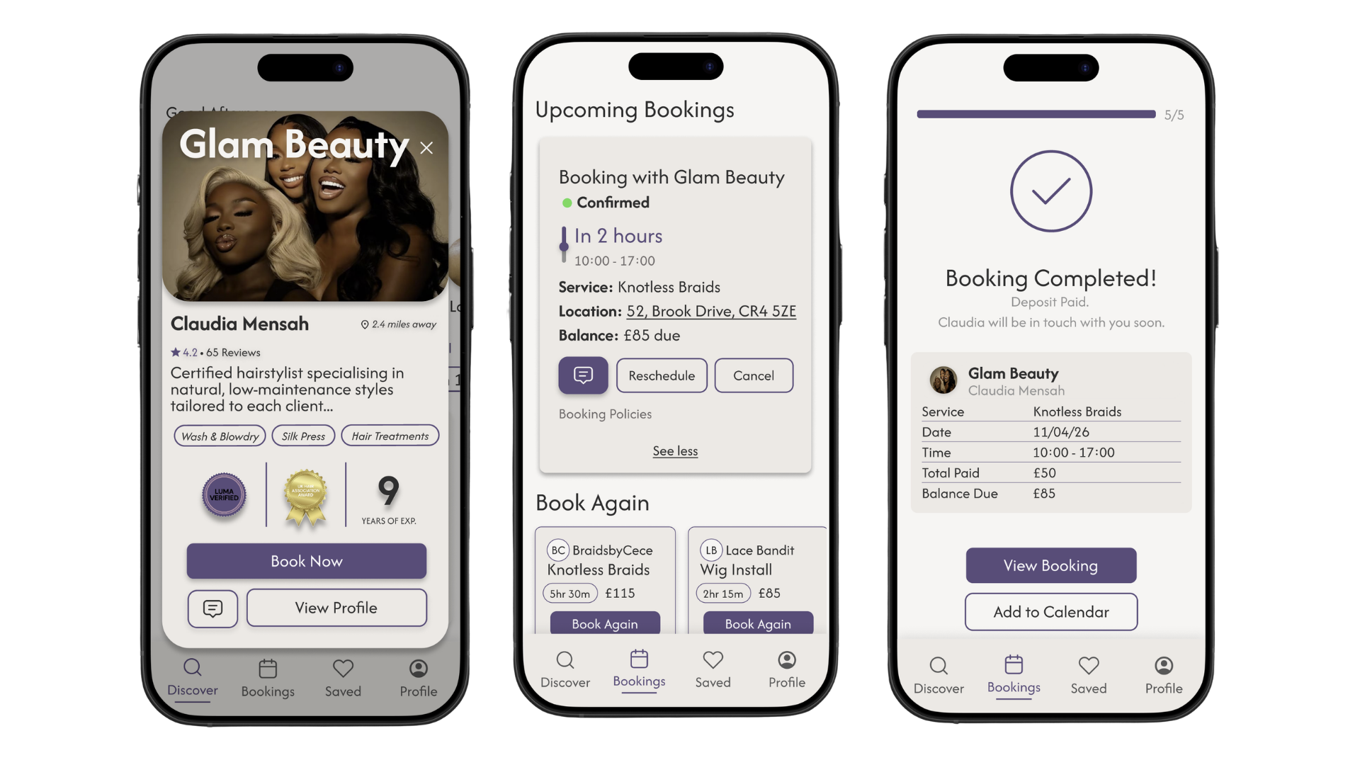
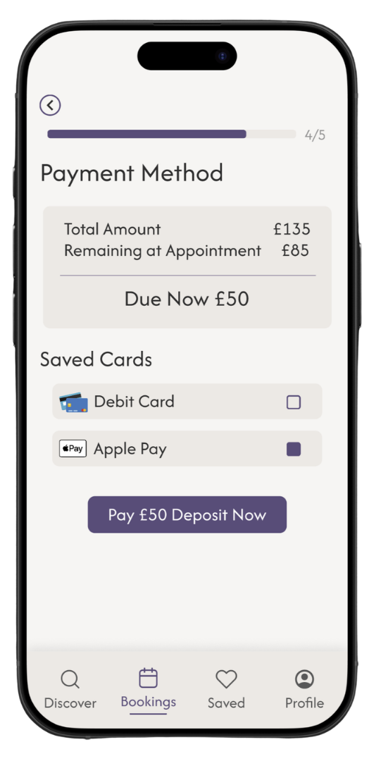
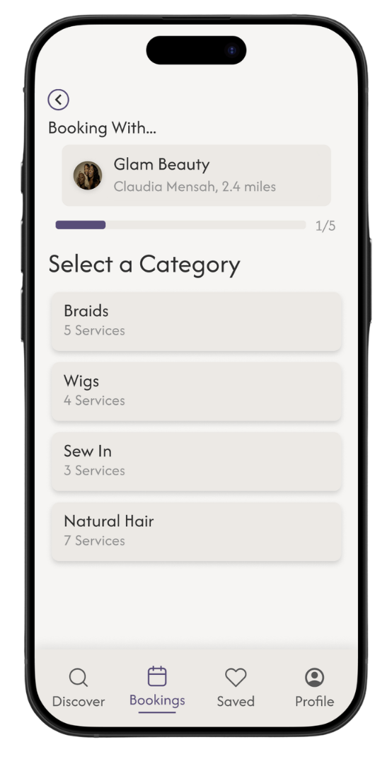
Feature 1: Appointment Tracking
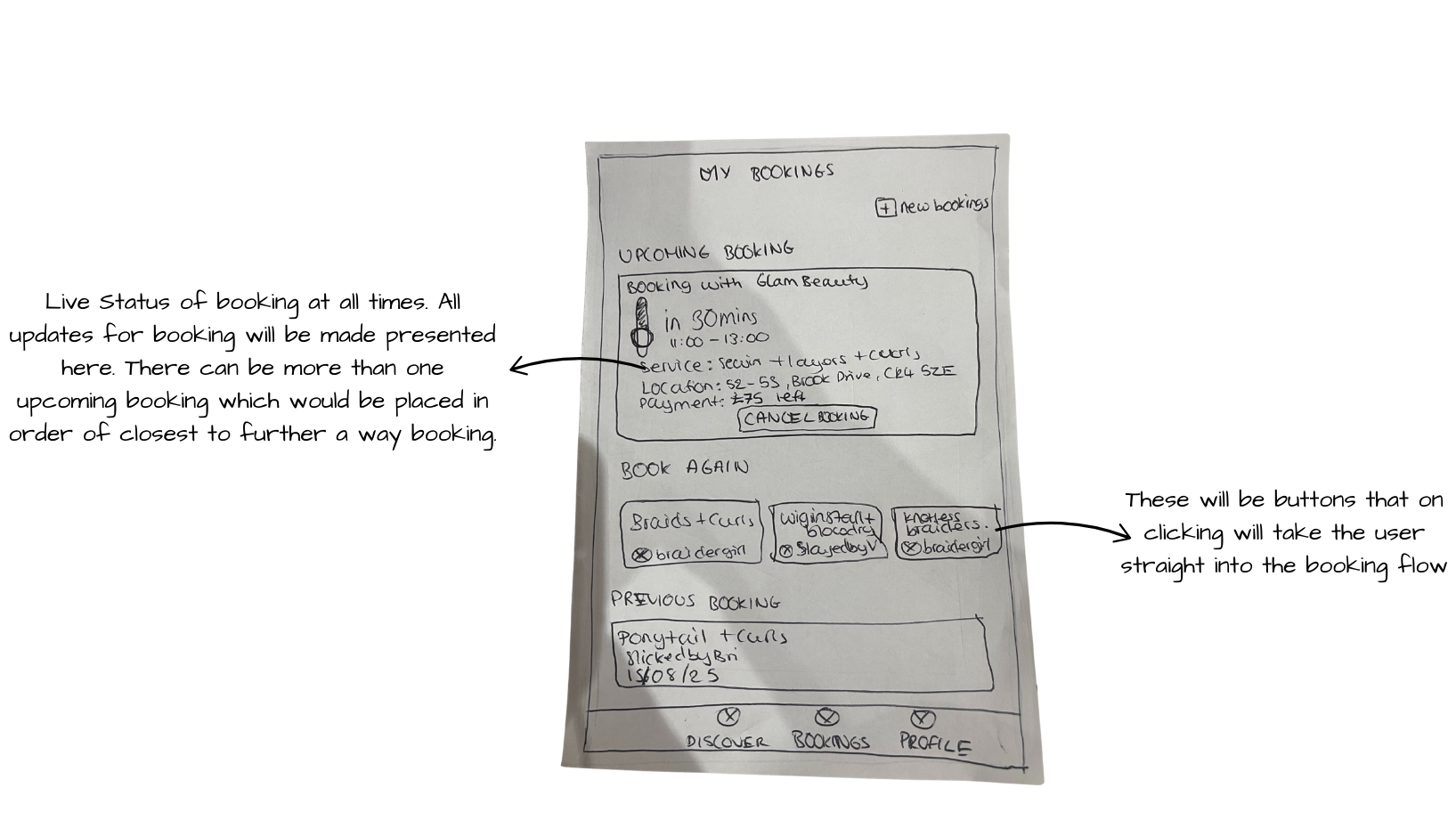
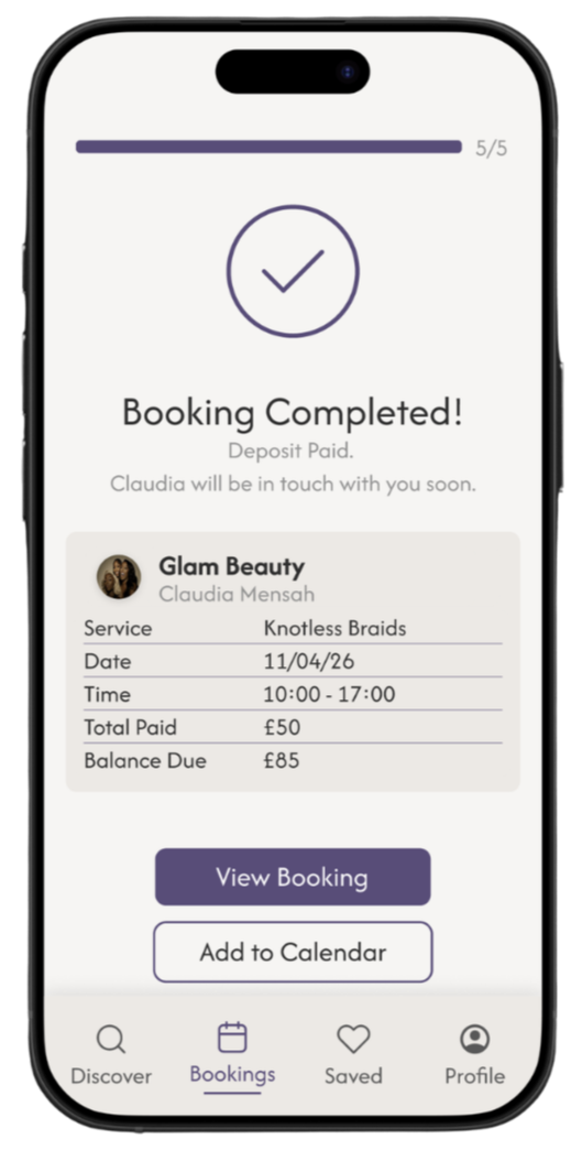
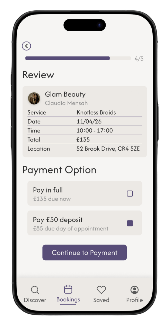
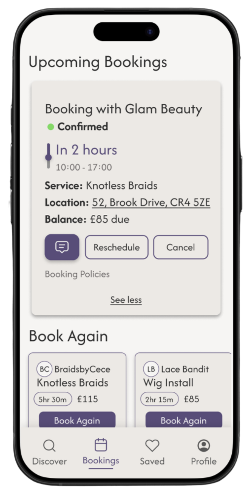
Users can check their booking status and any updates at any time within the “Bookings” section, while email and message notifications are sent upon confirmation to ensure users feel reassured and informed. Under “Upcoming Bookings” users are presented with a focused appointment view that surfaces the most relevant information at a glance, and then option to reveal extra details concerning appointment by clicking “see more” link. Live status updates, such as “30 minutes to your appointment,” alongside automatic reassurance email and message notifications will also be made available. This will help users feel informed and confident throughout the experience.
Accessibility Considerations: I simplified information density by introducing clear visual hierarchy, chunked content into digestible sections. Progressive disclosure allowed users to access deeper provider details when needed, rather than overwhelming them upfront.
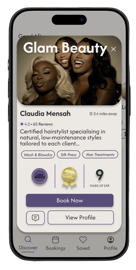
Feature 2: Service Provider Profile Card
To strengthen trust before booking, each provider profile clearly displays key credibility indicators, including certifications, training history, and insurance status. Once credentials have been reviewed, a “Verified by Luma” marker is shown on the profile, helping users quickly recognise qualified professionals.
Accessibility Considerations: I made sure trust badges and ratings were supported by icons and labels to avoid relying on colour alone to communicate meaning, ensuring clarity for users with visual impairments or colour vision deficiencies.
Develop
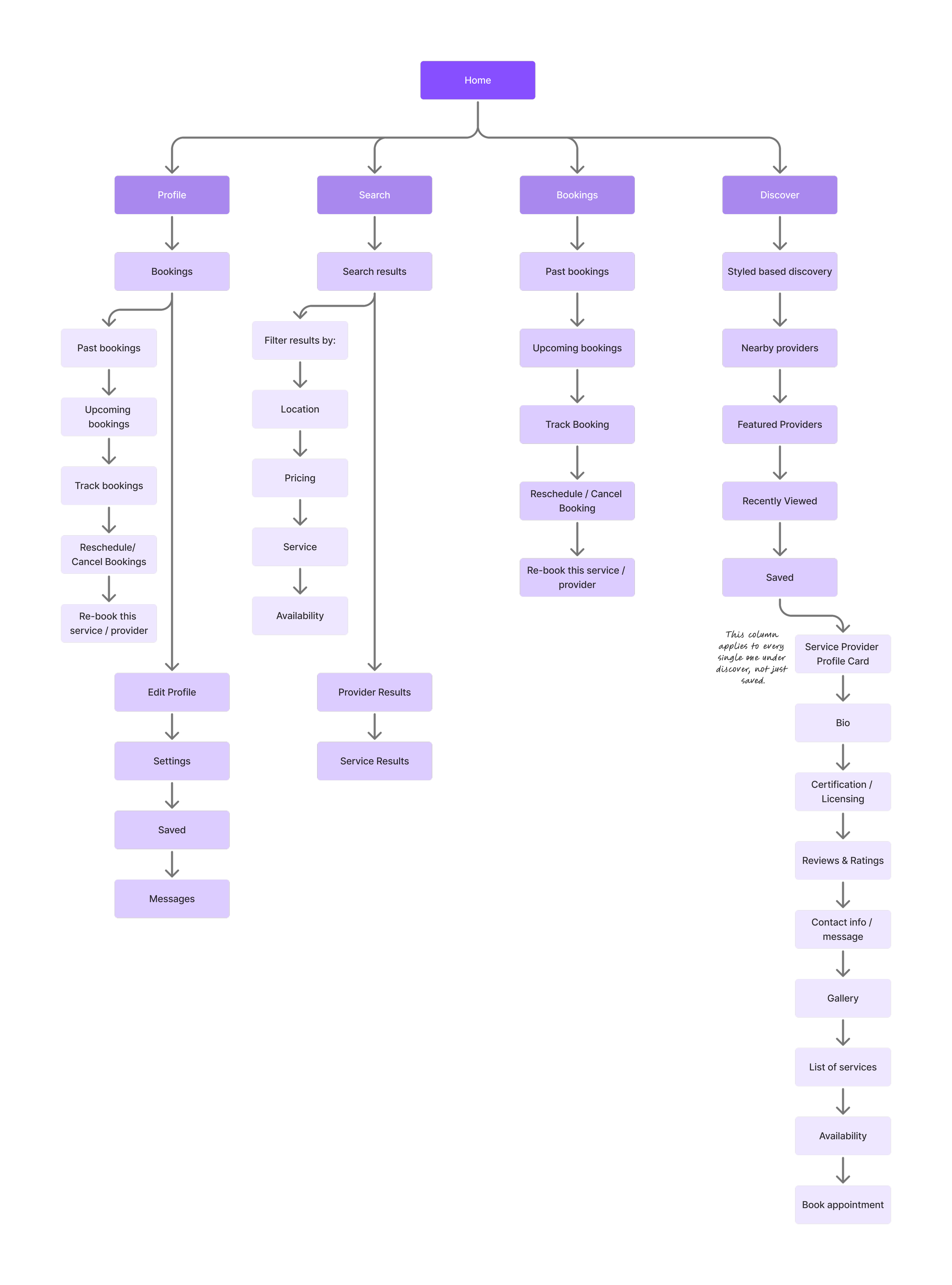
Sitemap
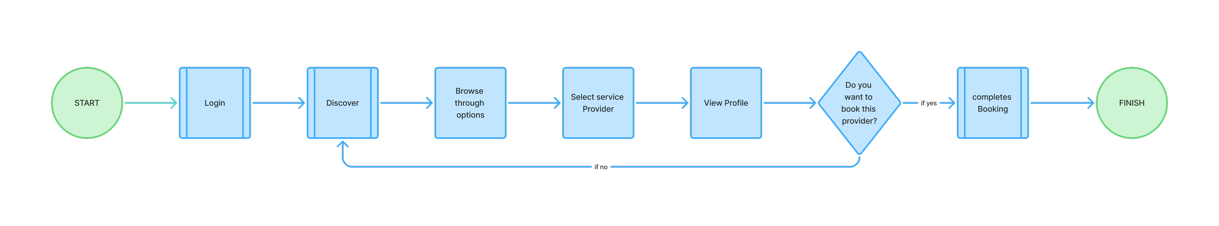
User Flow
*View Service Provider Profile Card*
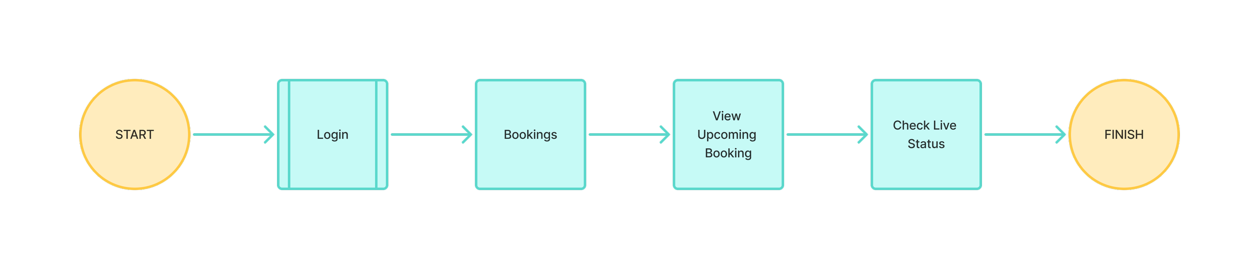
*Appointment Tracking*
Paper Wireframe
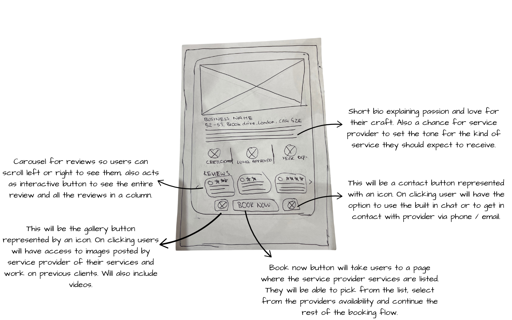
I initially sketched Option 1, but found the layout visually dense for a profile card and required too much interaction from the user. To improve clarity, I sketched other versions of the profile card and ultimately selected Option 2, which presents the same information in a more concise, accessible format, reducing cognitive effort for users while maintaining informational depth.
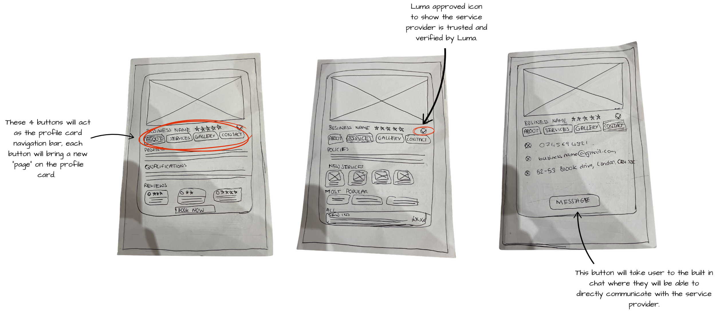
*Service Provider Profile Card - Option 1*
*Service Provider Profile Card - Option 2*
*Appointment Tracking*
Testing & Iterations
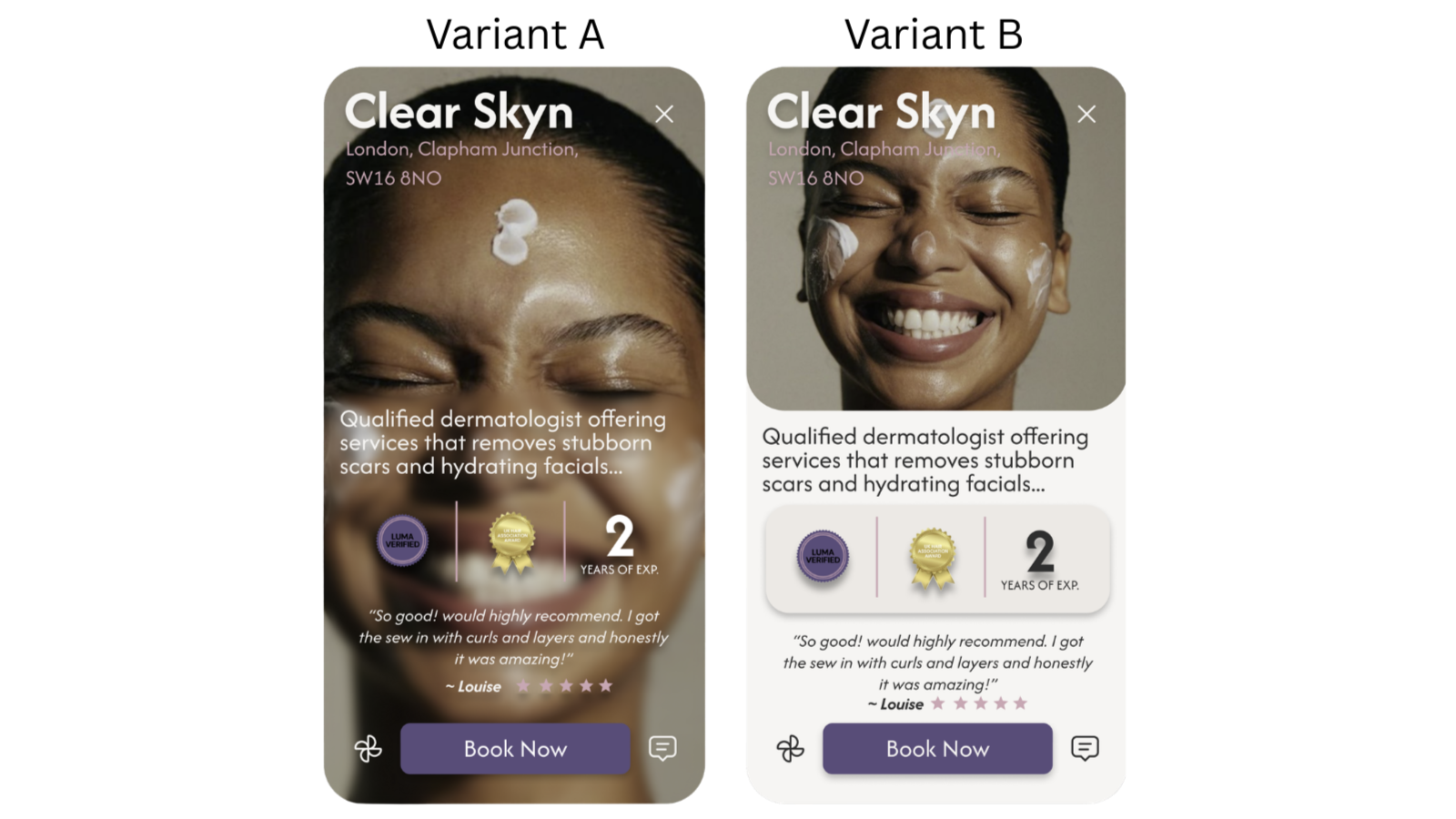
Hypothesis: I went into this test expecting Variant B to perform better. The content-first layout felt more structured, the information hierarchy clearer, and the credential panel easier to process at a glance. My assumption was that separating the image from the supporting details would reduce cognitive load and give users a faster, more confident path to booking.
Testing Results: A/B testing revealed that 66% of users preferred the content-first layout (Variant B) thus proving my hypothesis. On Variant B users consistently located credentials, services, and trust signals faster and with less effort than the more visually led alternative (Variant A). This confirmed that confidence is built through structure, not aesthetics, as users scan, assess, and decide in seconds rather than lingering on visual details.
Impact: The design was iterated accordingly, introducing separate service pills for scannability, a combined rating in place of individual quotes, a clearer CTA hierarchy, and a dedicated credential panel. These changes were designed to surface trust signals immediately, winning user confidence before they had the chance to hesitate.
*Mid - Fidelity Service Provider Profile Cards*
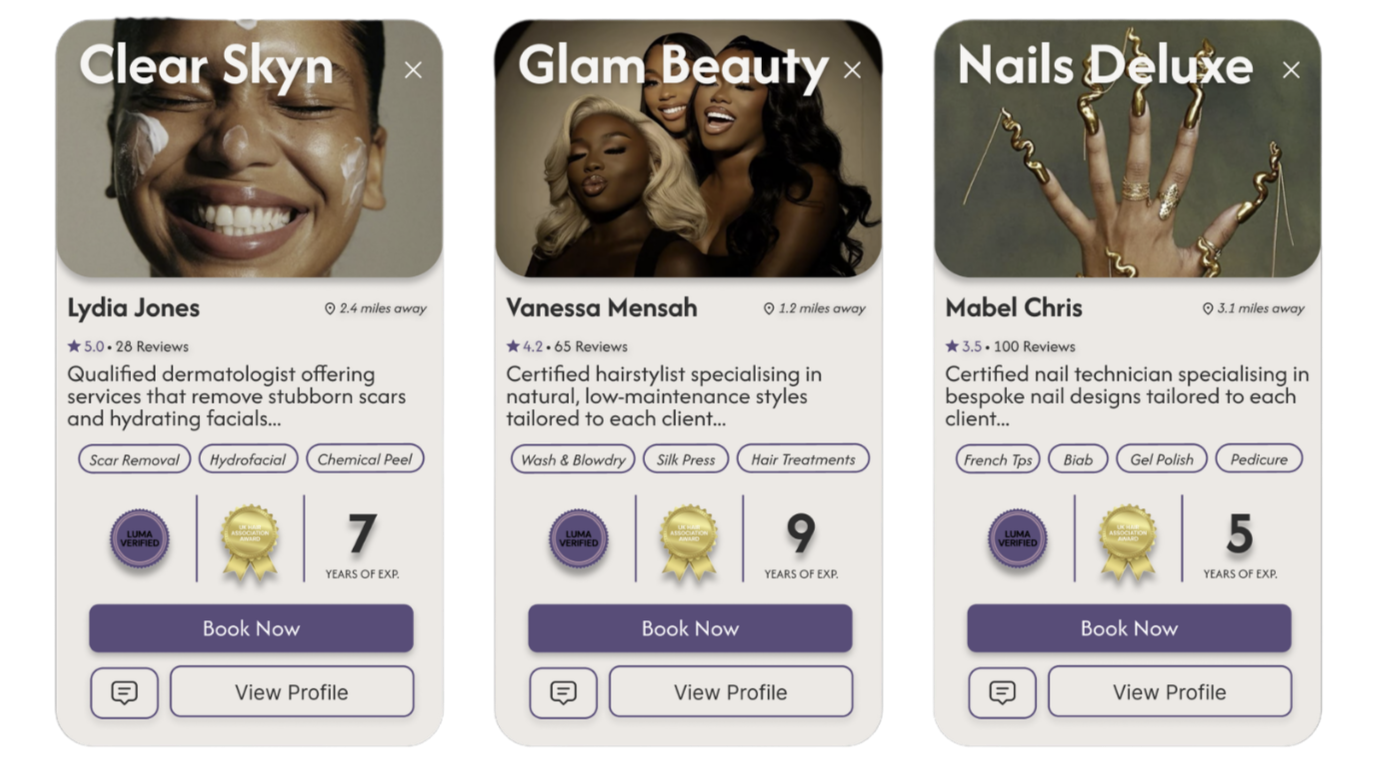
*Final Service Provider Profile Cards*
Trade Offs
Personalisation vs Scalability
Highly personalised profiles were considered but ruled out due to inconsistency and development complexity. Instead, modular profile components were designed to allow content variation within a consistent structure, balancing personalisation with scalability.
Information Depth vs Clarity
Displaying too much provider information upfront increased cognitive load and slowed decision-making, so I prioritised strong hierarchy and progressive disclosure, keeping the layout clean and scannable while allowing users to access deeper details when needed.
Reassurance vs Performance
Research showed users prioritised appointment clarity over behavioural metrics, so I focused the dashboard on booking status and provider details, keeping the structure open to future features like loyalty progress without compromising the reassurance-led experience.
Deliver
Final Prototype
Reflection
Possible Impact If Luma Was Brought to Life
If brought to life, Luma could shift beauty service booking toward a confidence-led marketplace, where trust, professionalism, and reliability drive user decisions. By making provider qualifications, credibility, and appointment status more visible, the platform could reduce booking anxiety and enable more informed choices. Over time, this approach could help raise industry standards by rewarding professionals who prioritise transparency, skill, and consistent service quality.
What I Would Like To Add
If I were to approach this project again, I would complement social listening with user interviews to gather deeper, more targeted insights. While analysing comments and discussions provided valuable context around user frustrations, direct conversations with participants would have enabled more specific responses to key research questions and strengthened the overall findings.
Key Takeaways
This project strengthened my UX and product thinking by pushing me to conduct a thorough research process that kept the user and their core problem at the centre of every decision. It was also my first experience running A/B testing, which showed me how comparing design variations provides clear, evidence-based direction rather than relying on assumption. Most importantly, it deepened my understanding of empathy in design, reinforcing that the most intentional design decisions come from a genuine awareness of users' emotions, motivations, and real world experiences.
View Next…
BeLingual
Role: Product designer
Product: BeLingual is a language learning platform designed to build speaking confidence through immersive practice and genuine community between students.
Duration: 4 weeks
Tools: Figma