Case Study: Clarity
Clarity is a conceptual finance app designed to help young adults who avoid financial tools because they feel intimidated. I led this project to uncover why current tools fail this group and design an experience that not only simplifies financial tasks but also motivates sustained engagement.
Background
A Quick Synopsis…
Brief
The concept is: Clarity is a new business entering the finance market with a mission to empower young people to take control of their money. After identifying a gap in the market specifically, the lack of finance platforms designed for younger audiences stakeholders set out to create a product that makes saving and investing simple, approachable, and personalized. The result is a platform that uses an AI assistant to make money management less intimidating and personalised.
Problem
For many young people, budgeting tools don’t just feel complex - they feel intimidating. During early conversations, participants admitted they’d rather avoid their finances entirely than open an app filled with dense screens and unfamiliar language, often putting off addressing their finances. This problem mattered because financial anxiety leads to avoidance, which inhibits essential life outcomes such as saving for emergencies. From a product perspective, if there is cognitive friction and a lack of clarity, users are less likely to continue using the platform which means retention rates will low which is a major problem for any platform.
Approach
As a Product Designer, I worked across the full Double Diamond process: Discover, Define, Develop, and Deliver. Based on early research insights such as users feeling overwhelmed by too much financial data, I prioritized qualitative interviews over surveys to deeply understand emotional barriers. I chose to create personas to clarify user goals and fears rather than generic demographic segments, because emotional motivation (confidence vs anxiety) was the primary driver of usage. I used empathy maps to capture not just actions but feelings, which later informed UI tone and language choices.
In the Develop phase, I translated these insights into concepts, wireframes, user flows, and low-fidelity prototypes, iterating based on feedback and usability testing. Finally, in the Deliver phase, I refined the chosen solution into high-fidelity designs, validated the experience through additional testing, and prepared the final prototype.
Goals
Help users understand where their money is going
Create a feature that encourage positive habits like saving and budgeting
Reduce anxiety and cognitive friction around money management
Design a visually engaging but calm interface that builds trust and feels approachable for a younger audience
Possible Impact
Boost young people’s confidence and comfort when it comes to managing their finances.
Increase the number of young people who are saving, as well as the total amount they have in savings.
Encourage better self-discipline and good habits in young people.
Discover
To get started I wanted to gather as much information as possible …
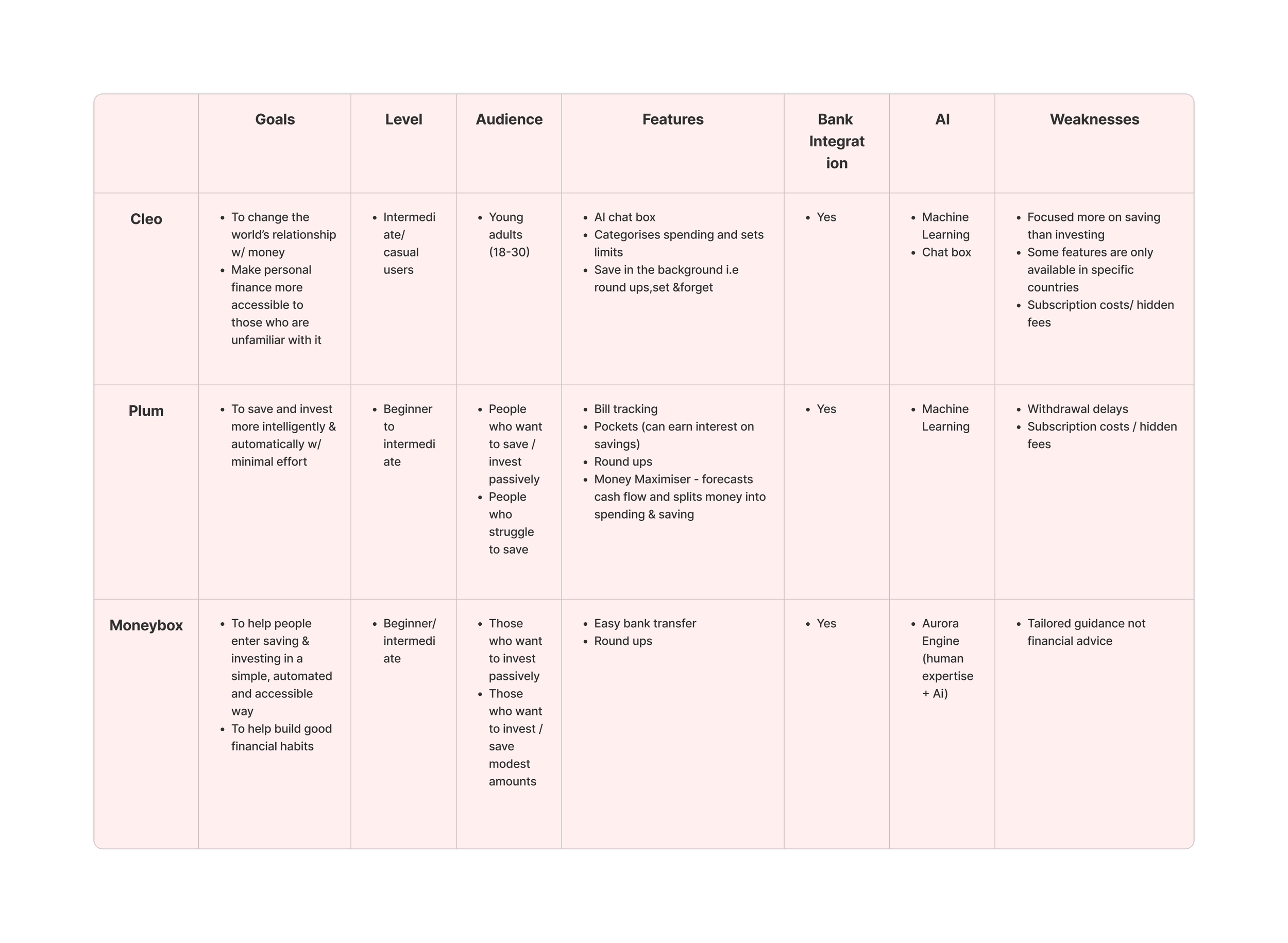
At the discovery stage, my focus was on building a clear understanding of the problem space before shaping any solutions. I started with desk research to explore the wider financial landscape, synthesising insights into a competitor analysis that highlighted patterns, gaps, and opportunities. This helped me understand where Clarity could meaningfully differentiate while staying grounded in real-world constraints.
Competitor Analysis Table
Insights that can be drawn from the competitor analysis table are:
Insight 1: There is an opportunity to use AI to provide clearer financial insights and explanations, helping users understand why their money behaves a certain way. Why This Matters: When financial tools automate decisions without explanation, users gain little understanding of their financial behaviour. AI-driven insights can improve financial awareness by clearly explaining spending patterns and their impact.
Insight 2: Users may benefit from more personalised financial recommendations that help them make informed decisions. Why This Matters: Financial data alone does not tell users what actions to take. Personalised recommendations help turn insights into clear, actionable decisions that improve financial confidence and behaviour.
User Interviews
Alongside this, I ran qualitative user interviews using open-ended questions over surveys or rating scales so participants could talk openly about their feelings towards finance tools, rather than trying to reduce those experiences to a number. This allowed me to better understand how people feel about managing their finances, not just what they do. These conversations surfaced emotional barriers and mental models that later shaped how the problem was defined.
For the user interviews I spilt the questions into 5 categories:
These categories allowed me to define the results and pinpoint each stage of the user experience from how they feel towards money, conversations they have surrounding money and the actions they take as a result. This later helped inform the ideation stage as I was aware of users pain points and preferences. These categories also help me identify ways the business could directly meet the needs to users.
Example of some of the questions I included was:
As this was a conceptual project, it didn’t include direct stakeholder input. In a real-world context, incorporating that perspective would help shape features and design decisions to better balance user needs with business goals.
General Relationship with Money
Money Management Habits
Saving and Investing Goals
Platforms and Tools
Motivators and Barriers
When you think about personal finances, what emotions come up for you?
Where did you learn how to manage your finances?
What have taken towards reaching your goals?
What apps, tools, platforms do you use to manage your finances?
What would motivate you to save more regularly?
Define
Now I wanted to identify who exactly I am designing for and why…
Affinity Map
Once I had gotten the results from the user interviews I created an affinity map to identify the common behaviours, problems and desires between the interviewees. I then prioritised the 3 most popular themes which helped me to create a persona, empathy map, jobs to be done statements, problem statement and hypothesis. These are the following themes:
Persona
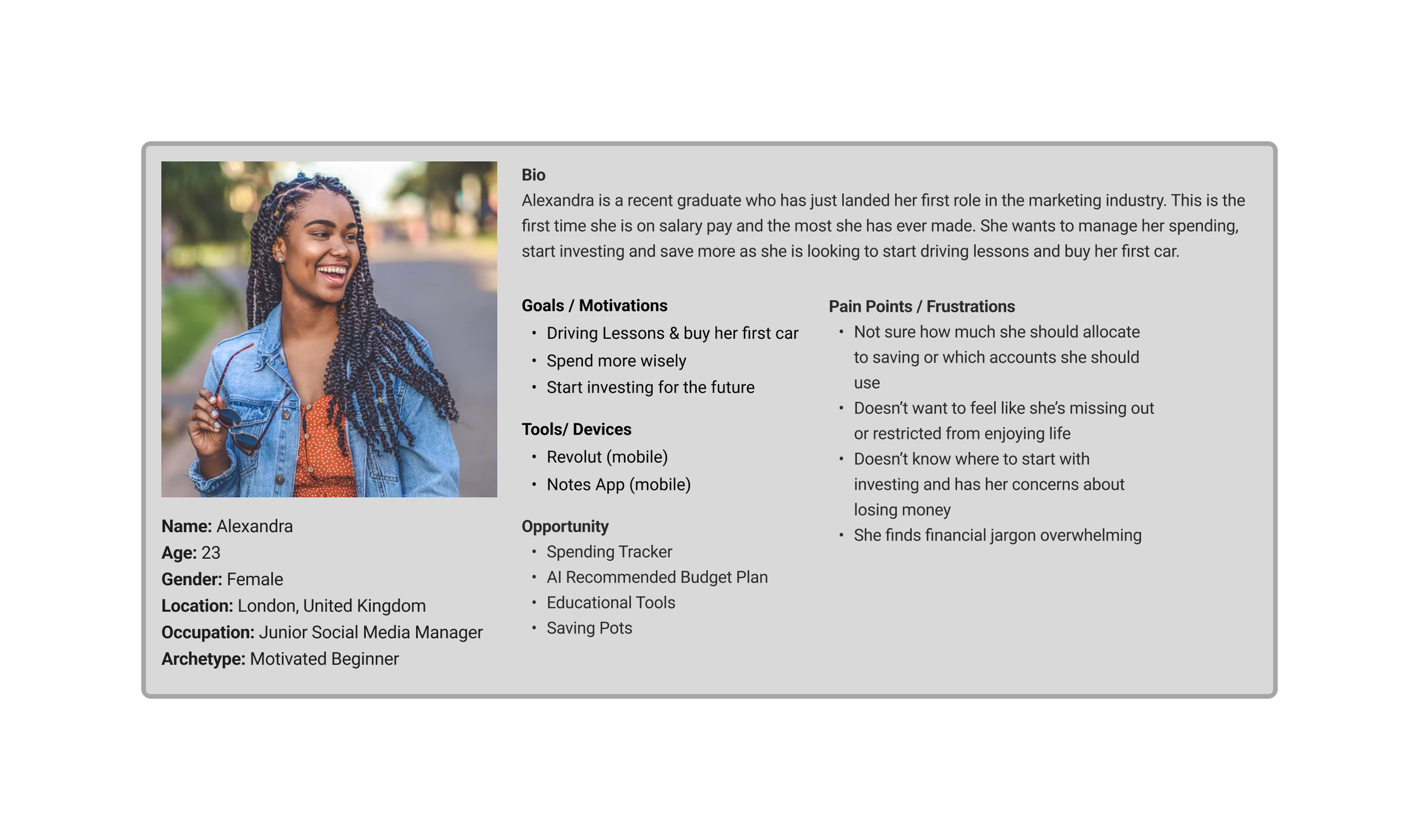
Once I had defined the users most common problems I then wanted to define the user. I did this by creating a persona and asked myself questions like: Who is most likely to struggle with budgeting? Where are they career wise? What responsibilities could they potentially have? From this I then created the persona below for Alexandra:
Empathy Map
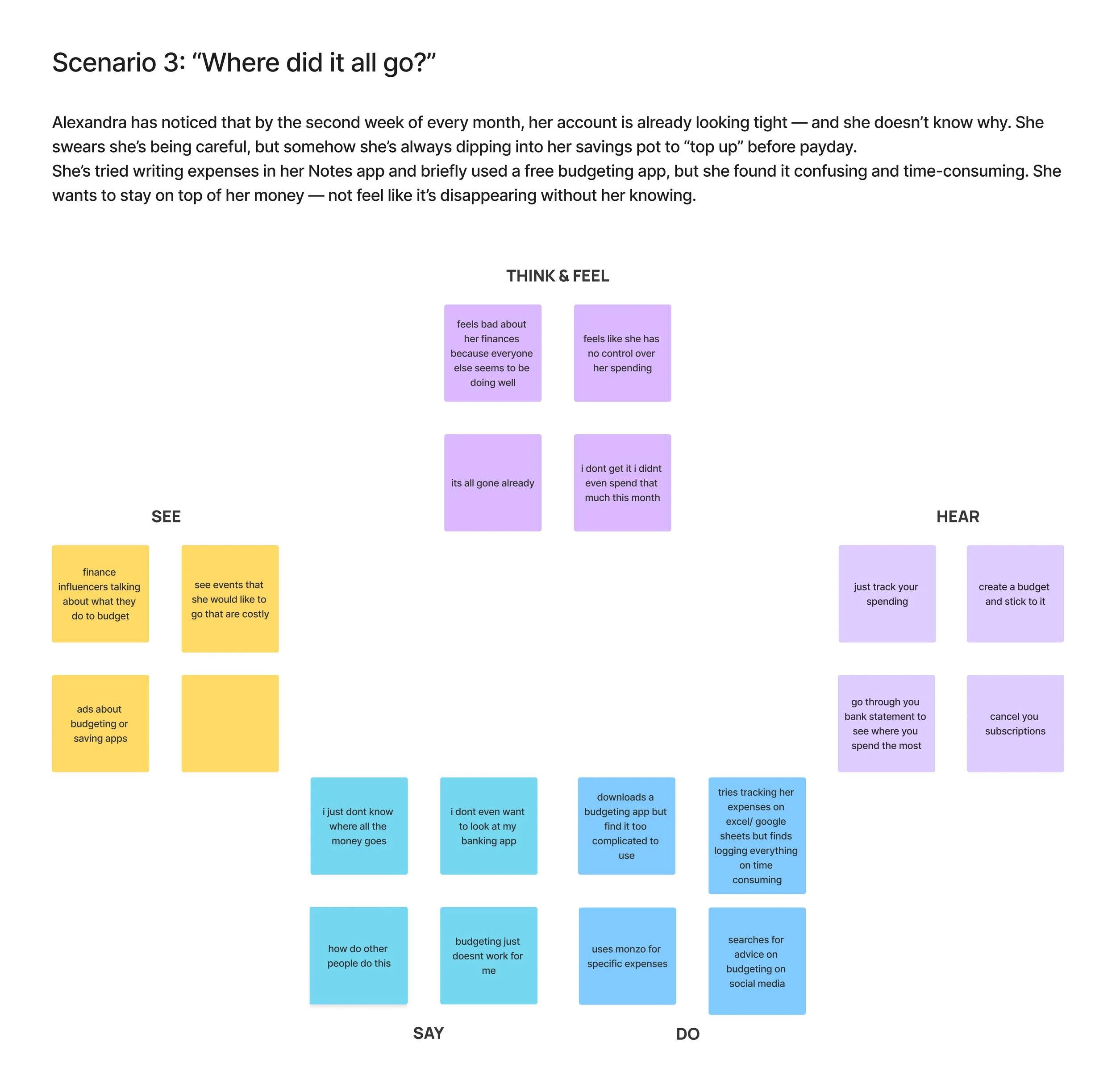
Now that I have created a persona I wanted to get into the mind of Alexandra and better understand her touchpoints and interactions with money. To do this I created an empathy map that allowed me to explore her thoughts and feelings towards money as well as what she may possibly see and hear concerning personal finances from her environment. I chose to use Empathy Maps over Experience Maps for this project because the problem was not with end to end user journey but rather user’s emotional and cognitive barriers to engaging with financial tools.
For the Empathy map I created 3 separate scenarios that Alexandra could potentially find herself in. Below is the 3rd one focused on budgeting:
Insights that can be drawn from the empathy map:
Insight 1: Users need clear, simple visibility into spending patterns so they can understand where their money goes without feeling overwhelmed. Why This Matters: This matters because financial awareness is the foundation of financial control. If users cannot clearly see where their money is going, they cannot make informed decisions about their spending or saving.
Insight 2: Users want low-effort financial tracking that reduces manual input and complexity. Why This Matters: This matters because when financial tracking requires too much effort, users stop doing it.
Insight 3: Users need personalised guidance, not generic financial advice. Why This Matters: Generic financial advice often fails because it doesn’t reflect individual habits, goals, or circumstances. Personalised guidance makes financial decisions more relevant and actionable, helping users build sustainable financial habits.
Upon completing the empathy map, I created “jobs to be done” statements, problem statements, and a hypothesis. I based all three on the persona Alexandra and her empathy map, which then informed the solutions that were developed.
Jobs To Be Done
“As a recent graduate who has just started my first salaried role, when I get paid I want to track my spending without having to log everything in all the time so I can be in control of my spending without it taking up too much of my time”
"As a recent graduate who has just started my first salaried role, when I get paid, I want to budget my pay checks using a straightforward, easy-to-follow system, so that I can stay on top of my finances and not feel overwhelmed."
Problem Statement
Alexandra, a motivated beginner, needs a simple way to manage and budget her finances because many banking apps lack clear spending insights, and traditional bank statements feel overwhelming and hard to interpret.
Hypothesis
We believe that creating a beginner-friendly, easy-to-use finance app for young people interested in saving and budgeting will help them build confidence and develop a healthier relationship with money. We will know this is true when we see an increase in the number of young users actively saving consistently.
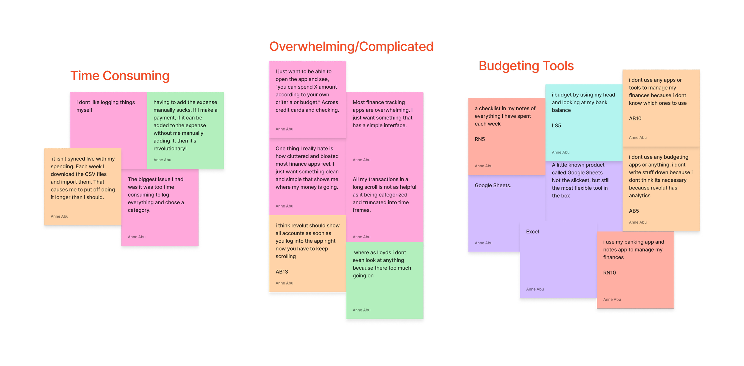
Time Consuming: Users found it to be too much effort to continuously log and have to update spreadsheets or trackers in order to stay on top of their spending. This puts them off having spreadsheets or budgets.
Too Complicated: Users tend to find budgeting apps and financial management tools confusing and difficult to comprehended. This puts them off even looking at any analytics or stats to do with their finances.
Not Needed: Users didn’t find budgeting tools necessary when other platforms like Google sheets or Excel, that they are familiar with already, exist.
Ideation
Then I started to think of possible solutions that would directly solve the problems of Alexandra…
During ideation, I explored multiple concepts and feature ideas through sketching and rapid ideation exercises such as Crazy 8’s. Ideas were filtered based on how well they addressed the emotional barriers uncovered during research. I prioritized the AI-assisted budgeting feature because research showed users wanted guidance, not just generic tools. I also considered another features that research also showed would be beneficial to users.
1. AI Tailored Budgeting Plan
Insight: Young users are often told that they should create a budget and stick to it but never told how to create that budget and what it should look like and the ones they are introduced to are either too complicated or take up too much of their time to fill in.
Opportunity: A feature that uses an AI assistant to create a personalised, tailored budget plan based of every individual financial situation. The AI would use a machine learning algorithm that would take information from past bank statements to see spending habits and determine fixed costs as well as a short questionnaire filled in by users to discover goals, habits and feelings. This would all then be used to generate a suitable budget plan for the user. The plan should be easy to follow and keep up with. Accessibility Considerations: I prioritised clear typography, structured layouts, and grouped financial categories to make the budget plan easy to scan and understand. Spending categories were supported with labels and icons rather than relying on colour alone, ensuring the breakdown remained clear and accessible for all users.
2. Checking Balance Analytics
Insight: Young users don’t even bother looking at the analytics or bank statements of their checking accounts because it is filled with financial jargon that they do not understand and feels far too overwhelming to actually look at. Opportunity: Create an analytics section that breaks down user spending using visual representation like a pie chart and a colour key that will provide immediate clarity on users spending. AI assistant would be available to provide further insight and make suggestions based of the data and user goals. Accessibility Considerations: I prioritised clear typography, structured layouts, and grouped financial categories to make the budget plan easy to scan and understand. Spending categories were supported with labels and icons rather than relying on colour alone, ensuring the breakdown remained clear and accessible for all users.
Develop
I started to bring these solutions to life by thinking of the practical step by step user experience…
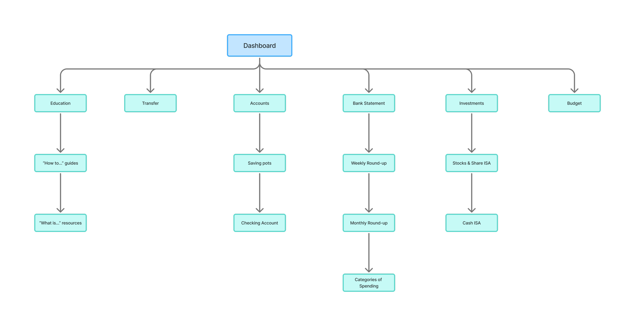
I translated the potential solutions into early user flows to ensure key tasks: checking balances, setting savings pots, and budgeting plan creation — were intuitive and low-effort. But first I focused on the information architecture of the entire platform. I created a site map to determine the structure and overall organisation of the platform to ensure content felt clear, predictable, and easy to navigate before moving onto user flows which outlined every step the user will take to perform a desirable action. The user flow then informed the wireframes created.
Site Map
User Flows
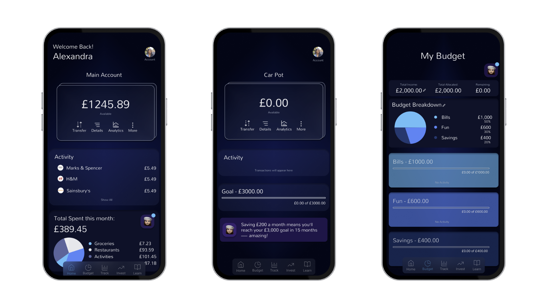
Paper Wireframes
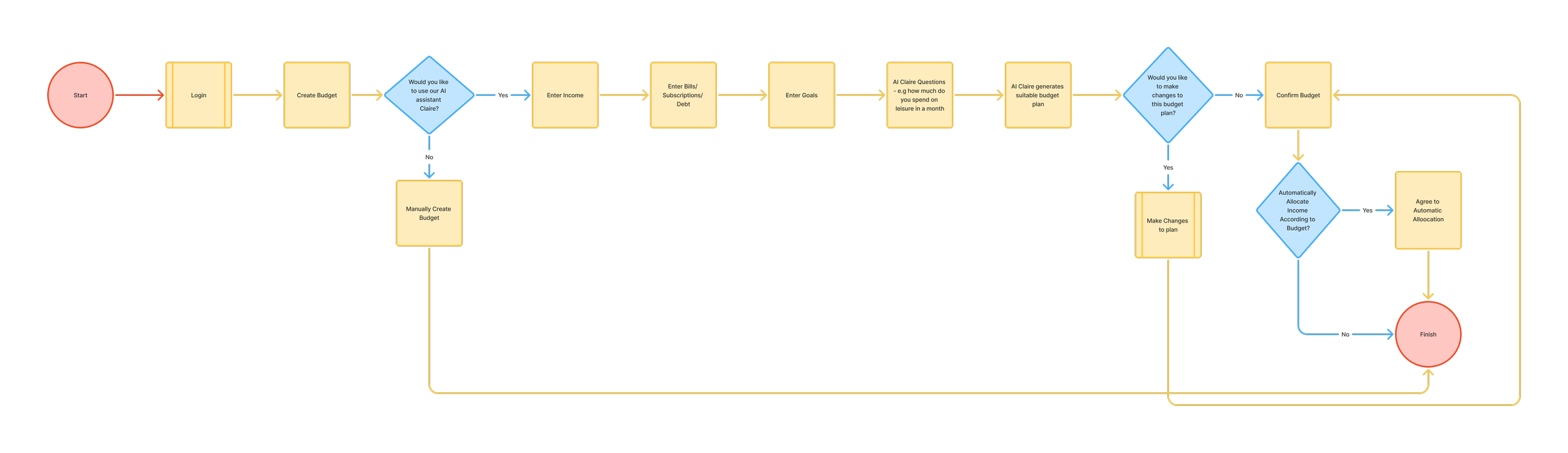
*User flow to create a Budget Plan with AI Assistant*
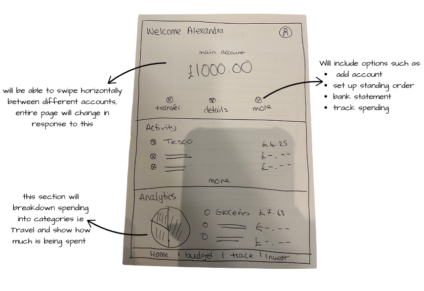
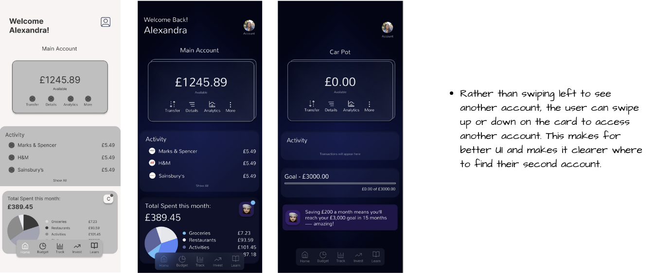
*Homepage*
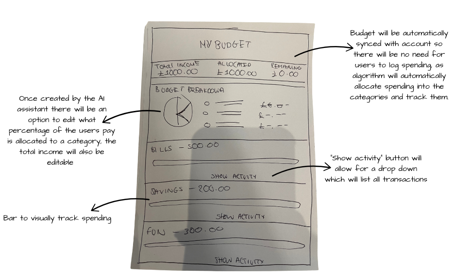
*Budget Plan Page*
Deliver
I conducted usability tests on the low fidelity prototypes with the same contributors used in the user interview stage. These tests gave me a chance to watch how users would interact with the platform within a realistic environment and an opportunity to troubleshoot any problems before making a final product. To do this I gave the users a clear and realistic task scenario, that would give a desired outcome.
Task Scenarios
Participants were observed setting up budgets and savings goals, with particular attention paid to moments of hesitation or uncertainty. I focused on clarity and confidence rather than speed alone. The tasks are as follows:
Task 1: “You’ve decided you want to take a closer look at you finances specifically what you have spent over the last couple of months - how would you do this”
Task 2: You want to gain more control of your finances and have been told budgeting is the best way to do this but you have no idea where to start and require some assistance”
Feedback
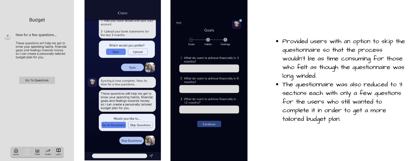
Feedback showed that users felt more comfortable navigating the experience and appreciated the guided approach, however they also did feel as though the questionnaire was a bit long winded and there should be an option to skip the questionnaire.
Iterations
Iterations focused on simplifying language further and refining flows where users paused or expressed doubt.
Finally I did some user tests before designing the final product…
“The questionnaire takes so long is there a way I can skip it?”
“Is there another way the budget could be broken down to me maybe with percentages?”
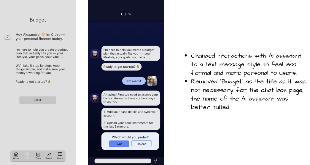
*AI Assistant Chat*
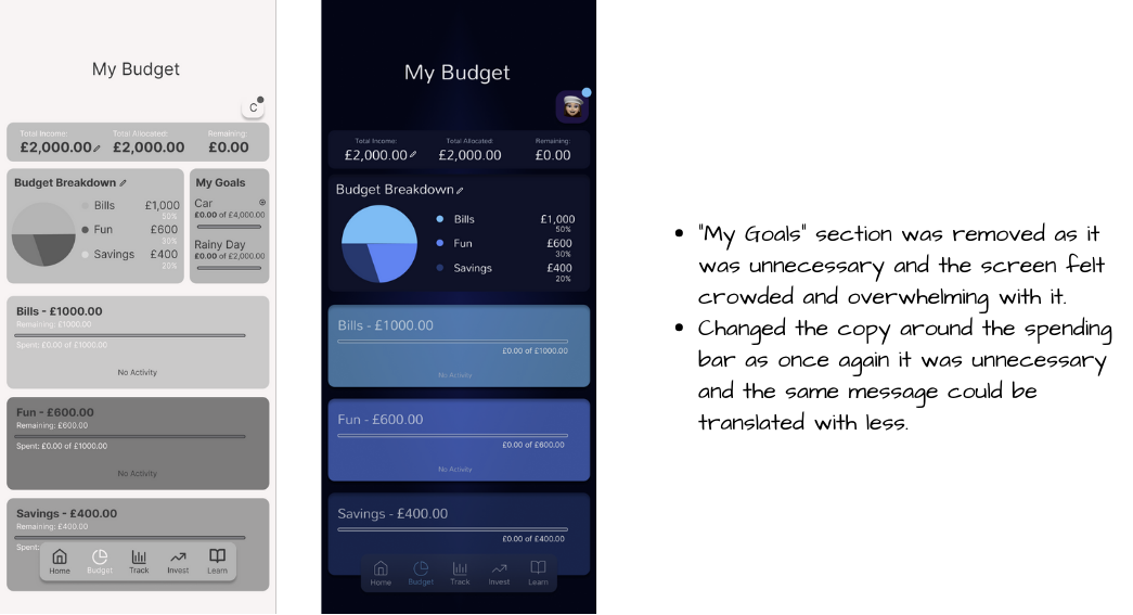
*Budget Generated by AI Assistant*
*Homepage*
Possible Impact if Clarity was brought to life…
As a conceptual project, Clarity was not launched, but testing indicated improved confidence and task understanding compared to existing tools participants had used.
The final concept demonstrates how a well-designed digital product could:
Boost young people’s confidence and comfort when it comes to managing their finances.
Increase the number of young people who are saving, as well as the total amount they have in savings.
Improve financial literacy among young people, helping them make smarter, long-term financial decisions.
Encourage better self-discipline and good habits in young people.
My final thoughts…
What I learnt…
This project highlighted the importance of clearly defining both the problem and the primary user experiencing it. Once I established these, developing an effective solution became significantly more focused and efficient. Placing the user at the centre of the process helped me to create an AI assistant that was designed to be supportive and approachable rather than overwhelming. This highlighted how thoughtful product design can positively influence financial confidence and long-term habits.
What I would do differently…
If I were to revisit this project, I would place greater emphasis on usability testing throughout the design process, particularly when validating interactions with the AI assistant. I would also introduce A/B testing to compare different budgeting interfaces and AI responses to determine which designs best encourage engagement and positive financial behaviors. I would also introduce measurable success criteria tied to business KPIs such as retention. These insights would allow for more informed iteration and a more effective final product.
How this project strengthened my Product Design skills…
This project strengthened my product design skills by improving my ability to translate user needs and research insights into thoughtful design solutions. It enhanced my ability to make informed design decisions, balance user needs with product goals, and iterate designs based on feedback. Designing with an AI assistant also enhanced my ability to think critically about tone, trust, and usability, reinforcing the importance of user-centred decision-making in product design.
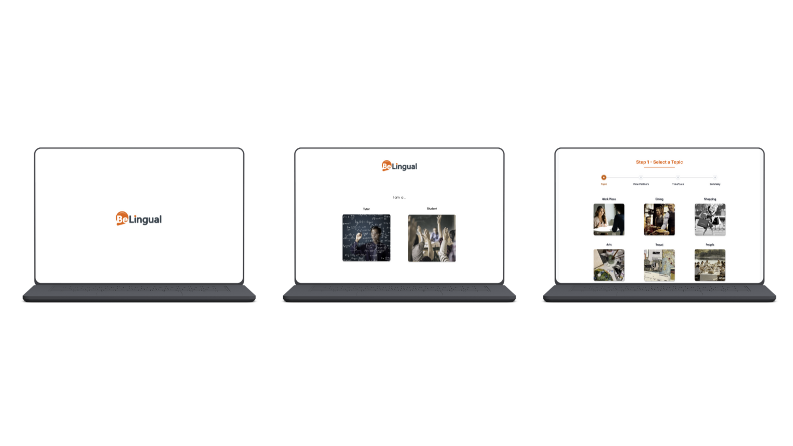
BeLingual
Role: Product designer
Product: BeLingual is a language learning platform that not only improves learning for students but streamlines duties for teachers.
Duration: 4 weeks
Tools: Figma
View Next…
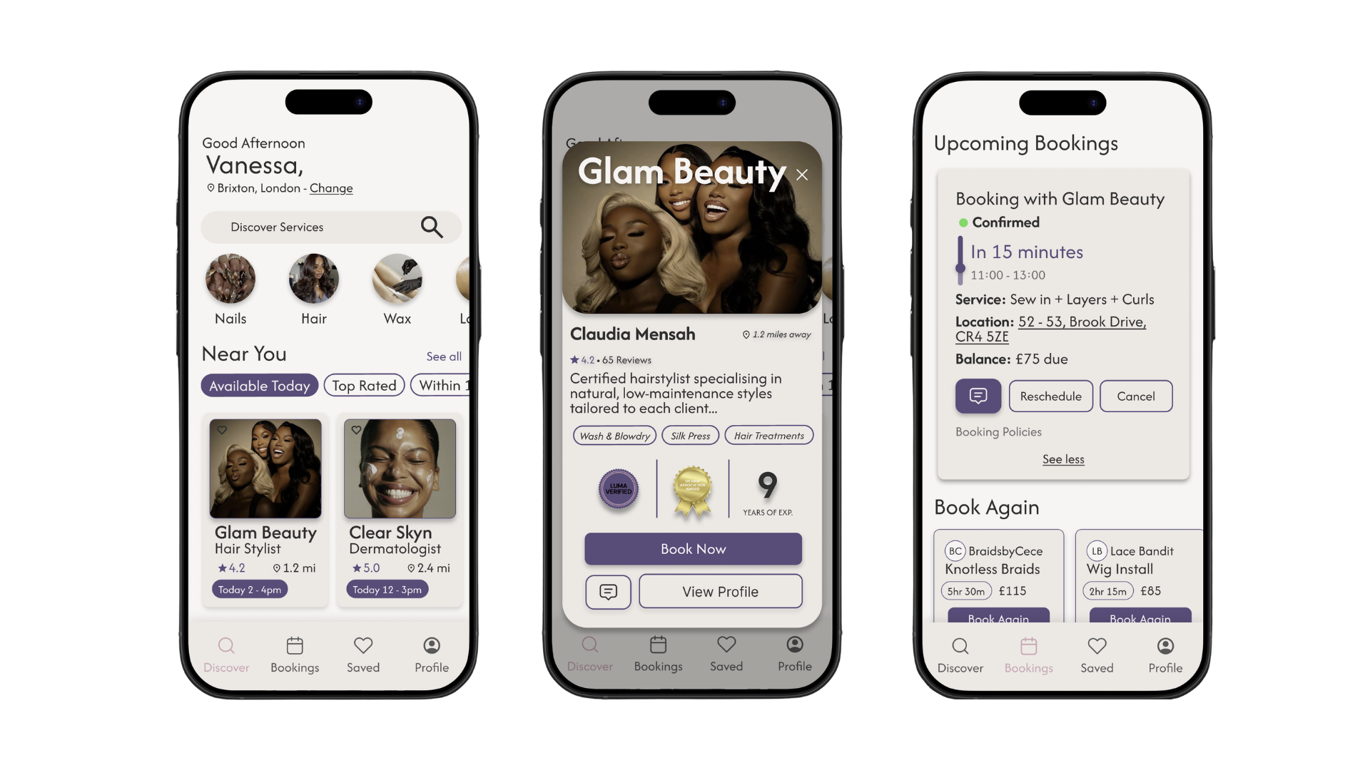
Luma
Role: Product designer
Product: Luma is a beauty service booking platform designed to help clients confidently discover, evaluate, and book trusted service providers.
Duration: 2 weeks
Tools: Figma