From Charity Website to Career Accelerator - Giving Bridging Barriers a Voice That Matches Its Vision
Bridging Barriers had the foundations of an impactful organisation but a digital presence that undersold its mission and failed to connect with the partners, donors, and mentors it needed to grow. As the UX Designer, I led the repositioning of the platform from a charity website to a career accelerator, designing an experience that clearly communicated purpose and impact to the right audience. This drove design decisions focused on inspiring action, with the goal of increasing donations, business partnerships, and mentor sign-ups.
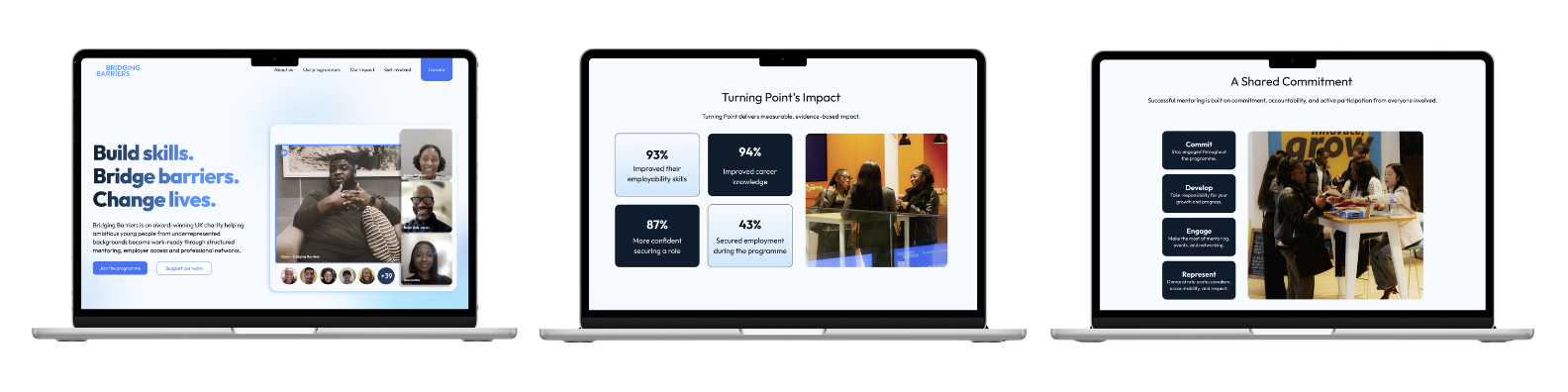
Design Process
I followed the Double Diamond process for this project as its framework of exploring the charity and its users deeply before committing to a direction ensured the redesign was driven by what partners, donors, and mentors actually needed to see, rather than what I assumed would resonate with them.
Discover
Market Research
Insight: The competitor analysis revealed that Bridging Barriers had a genuinely strong offering but was failing to communicate it in a way that felt distinctive or compelling. Competitors were showcasing partner logos, stats, and clear process flows that immediately built credibility, while Bridging Barriers' value remained buried and undersold.
Design Decision: This pointed to a clear opportunity to surface the richness of the programme and present it in a way that matched the ambition and impact of what Bridging Barriers was actually delivering to young people.
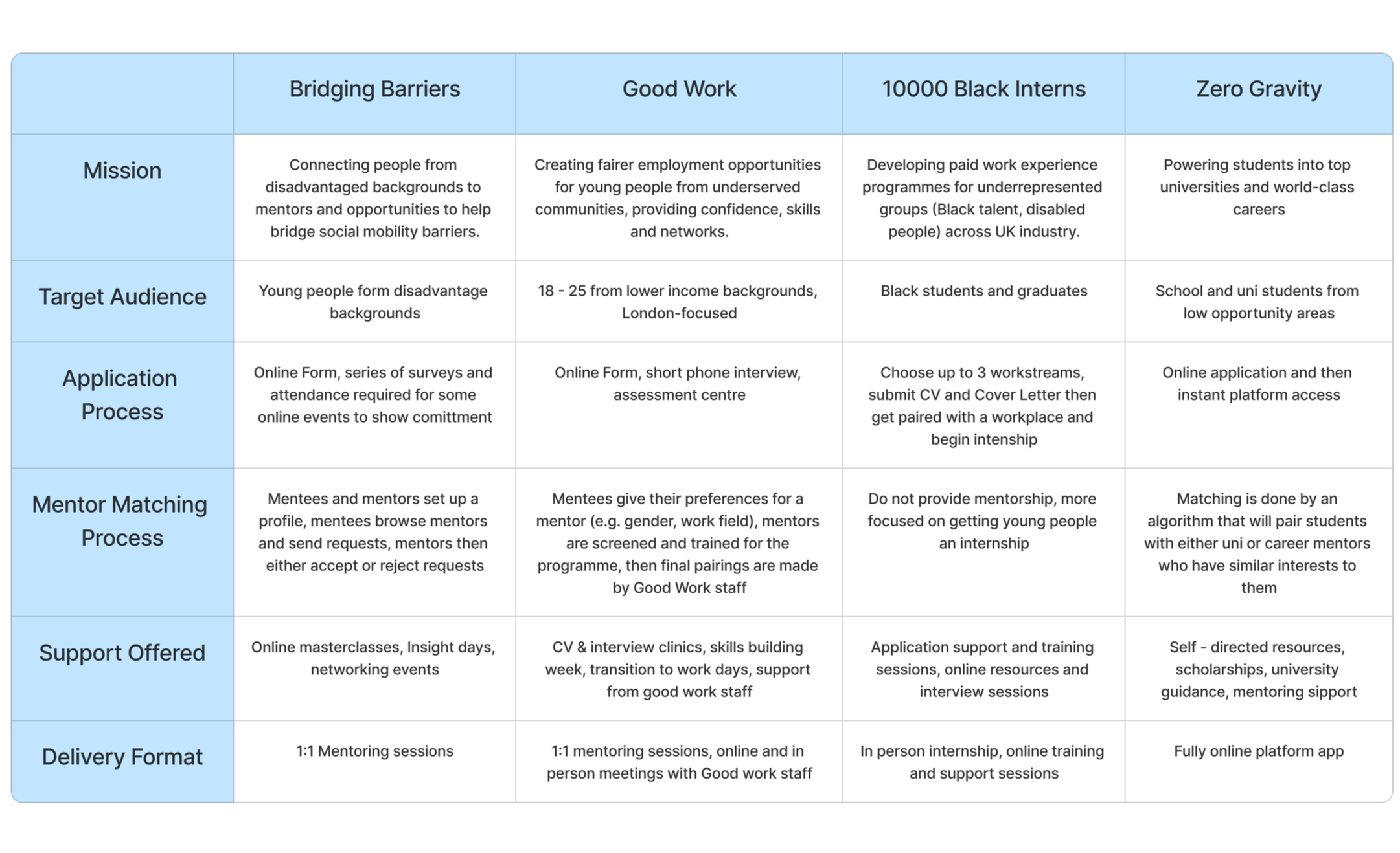
*Competitor Analysis Table*
User Research
Insight: User research across all three audiences revealed a consistent pattern: the website was failing to speak clearly to the people it most needed to convert. Mentees were dropping off due to a lack of clarity, proof, and a confusing application process. Mentors felt the website wasn't addressing them at all, with no clear sense of what the role involved or what support they would receive. Business partners were questioning the organisation's credibility entirely due to the absence of governance and transparency information.
Design Decision: This directed me to approach the redesign with each audience's specific needs and barriers in mind, prioritising trust, clarity, and a clear pathway to action for every user group. Whether that meant surfacing proof of impact through testimonials and real success stories for mentees, clearly outlining expectations for mentors, or providing the governance information partners were actively looking for, the goal was the same: a website that gave every visitor what they needed to take the next step with confidence.
Employer / Business Partner Findings
A governance and transparency page was one of the first things partners actively looked for, and its absence was enough to erode trust before a conversation had even begun.
Partners were also looking for the charity registration number as a basic marker of legitimacy, yet this was nowhere to be found on the site.
Mentor Findings
The mentor experience was consistently unclear, leaving motivated professionals feeling like the website was not speaking to them or addressing their needs.
Uncertainty around time commitment, expectations, and what support they would receive created doubt that was enough to stall sign up entirely.
Mentee Findings
Mentees arrived with genuine motivation but felt let down by a lack of clarity around what the programme actually offered and whether it was relevant to them.
Trust was a significant barrier, with users feeling uncertain without visible proof that the programme had worked for others like them.
Stakeholder Research
Insight: Stakeholder conversations revealed that the project had grown beyond a website refresh, with the client recognising that the website needed to do far more strategic heavy lifting across communications, credibility, and audience conversion.
Design Decision: This sharpened my focus significantly, directing me to approach the redesign not as a visual update but as a strategic repositioning, with messaging, positioning, and storytelling treated as core design challenges rather than secondary considerations.
Stakeholder Goals
Function as a strategic communications and positioning platform
Build credibility and trust with corporate partners and funders
Strengthen messaging to better reflect the organisation's ambition and impact
Create clear and distinct journeys for each audience
Drive conversions through a more intentional and outcome-focused stakeholder experience
Strengthen social proof and strategic storytelling across the site
Improve clarity for corporate partners and funders specifically
Define
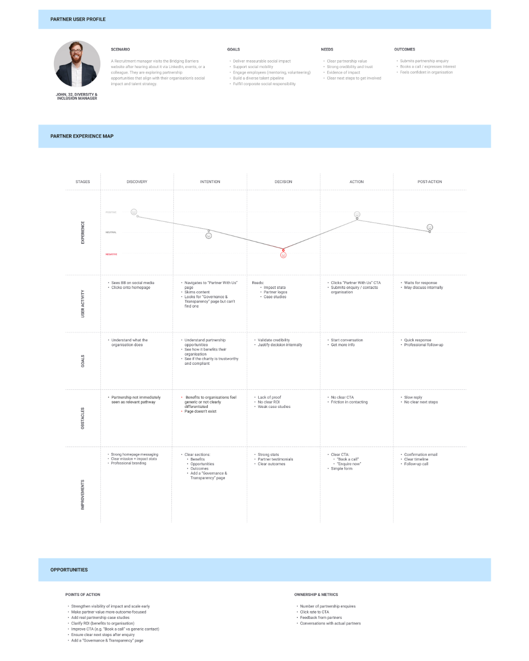
Employer / Business Partner User Story
Insight: The partner experience map revealed that John's confidence dropped most significantly at the decision stage, where a lack of proof and weak case studies left him unable to justify the partnership internally. Despite arriving with genuine interest, the website was failing to convert that intent into action.
Design Decision: This directed me to prioritise making the organisation's impact and credibility immediately visible, surfacing partner logos and real evidence of outcomes so that partners like John could find what they needed to feel confident and justify the decision internally without friction.
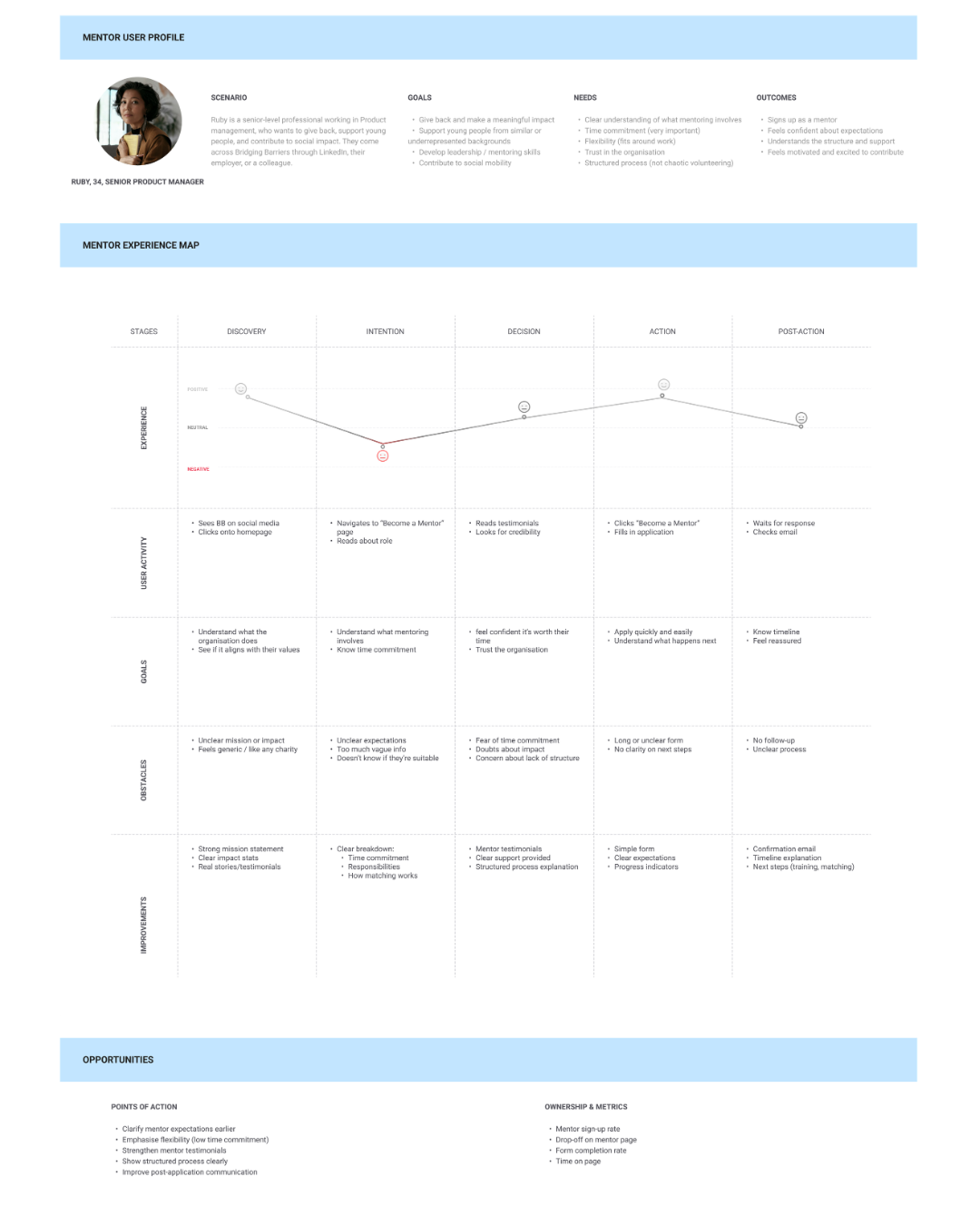
Mentor User Story
Insight: Ruby's experience map showed that despite arriving with a genuine desire to give back, the website gave her little reason to stay. At every stage she encountered vague information, no clear sense of the impact she would have, and a process that felt unstructured and difficult to trust.
Design Decision: This directed me to shift the mentor experience from passive information to active reassurance, giving Ruby a clear picture of her role, the difference she would make, and exactly what to expect from the moment she signed up.
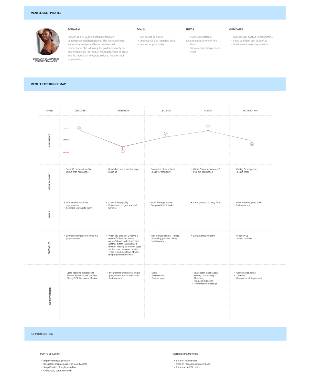
Mentee User Story
Insight: Brittany's experience map revealed that even when she had made the decision to apply, the journey let her down. A long and confusing application form created significant friction at the action stage, and a lack of follow up or clear timeline in the post-action stage left her waiting with no sense of what would happen next or whether her application had even been received.
Design Decision: This directed me to simplify the application form to reduce unnecessary steps, and introduce clear confirmation messaging and timeline communication post-application, so that Brittany felt supported and informed even after she had taken action.
Develop
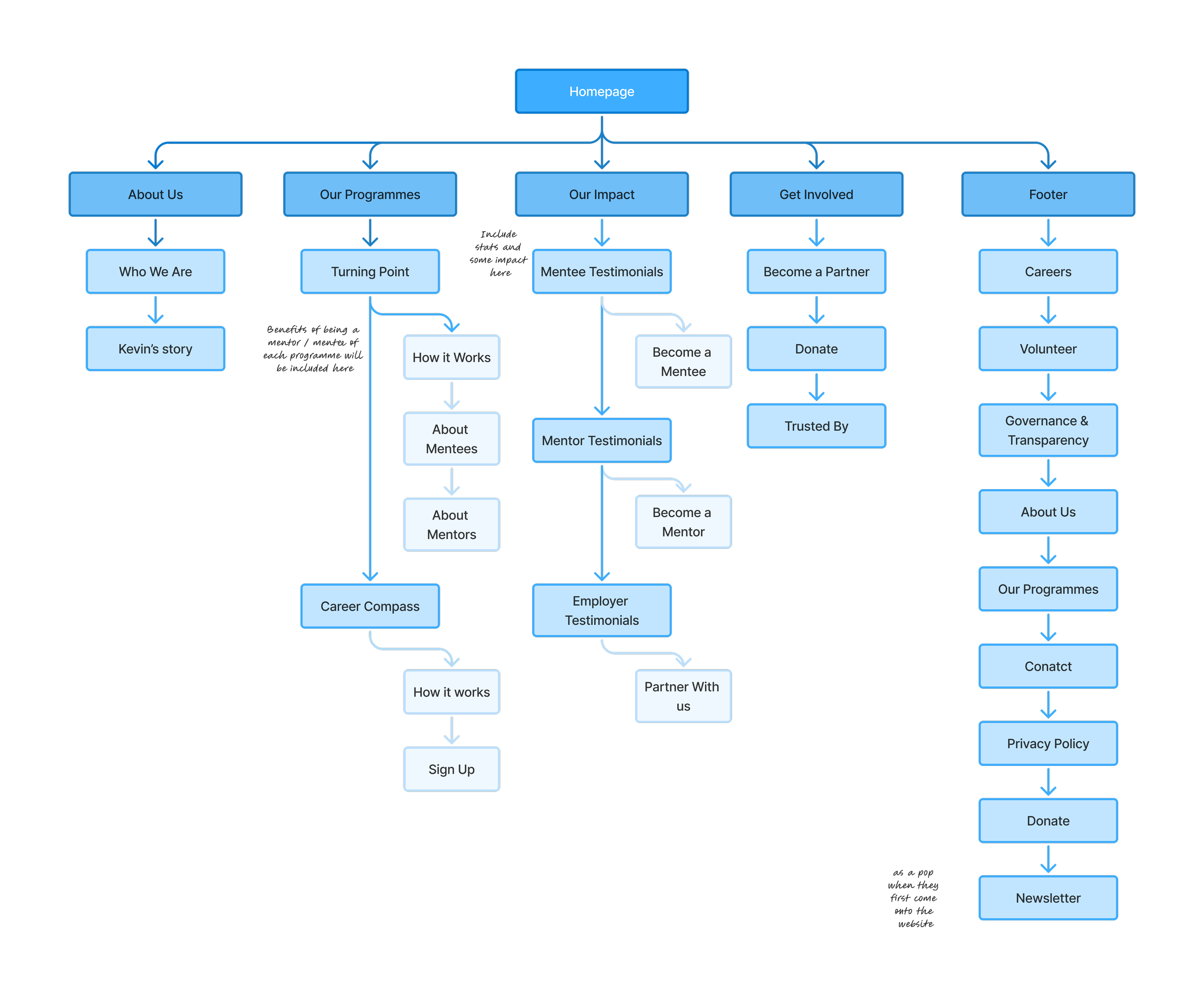
Sitemap
Business Partner User Flow
Mentee User Flow
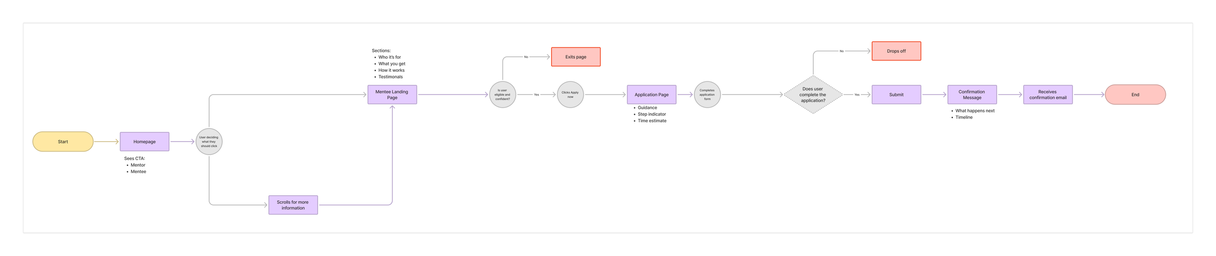
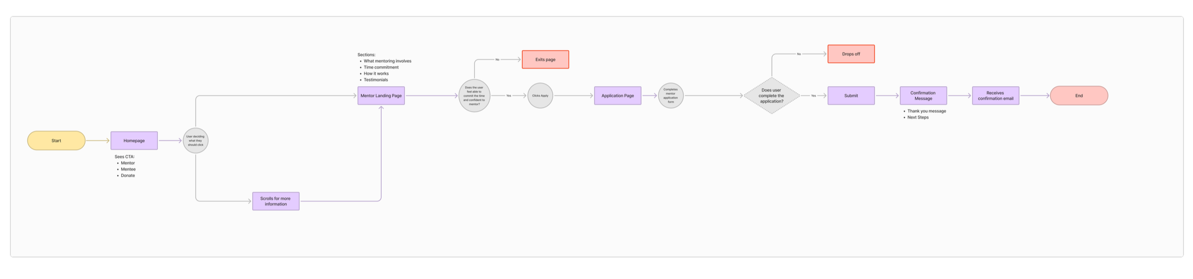
Mentor User Flow
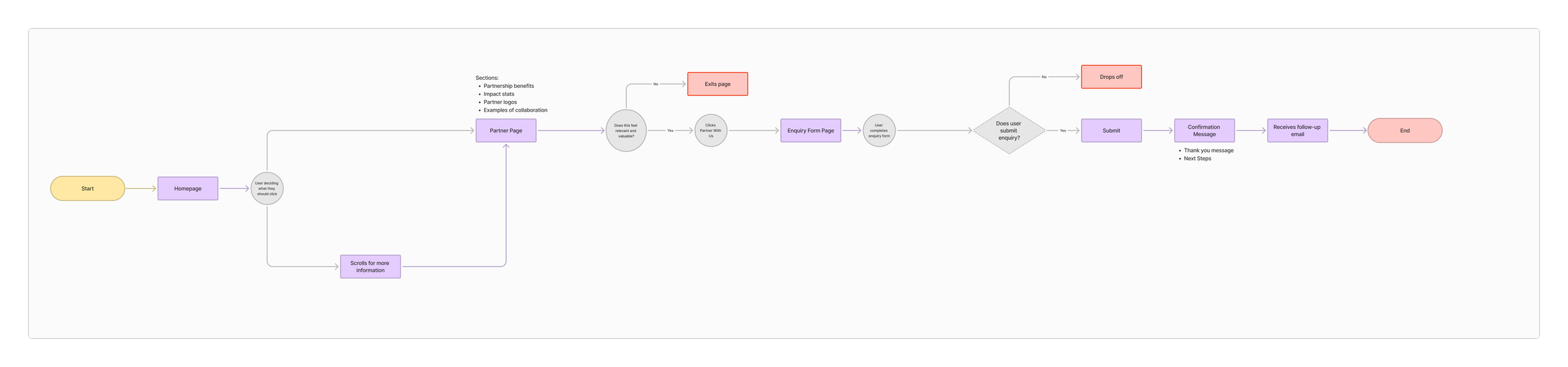
Usability Testing
User Testing Results: User testing revealed that the programmes page had room to do more, with visitors struggling to connect the programme names to the real outcomes and day to day experiences they represented. Compared to the rest of the site, the programmes page felt weaker in its ability to reinforce the depth of impact and value that Bridging Barriers delivered to young people.
Design Decisions: As a result, this led me to iterate the programmes page to lead with outcomes and activities rather than logistical information such as application processes, cohort cycles, and eligibility criteria. While this information remained in the final designs as it was still necessary and useful, the focus shifted toward communicating what young people actually experience and gain, bringing the real impact of the programme to the forefront.
Iterations
Iteration 1: Surfacing Impact Stats Immediately
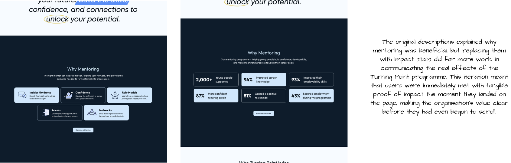
Iteration 2: Giving Career Compass a Clear Purpose
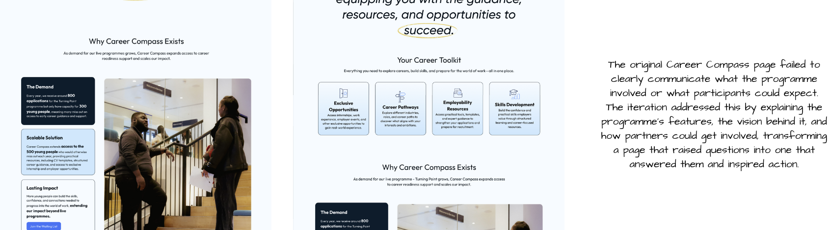
Iteration 3: Making the Programme Impossible to Miss
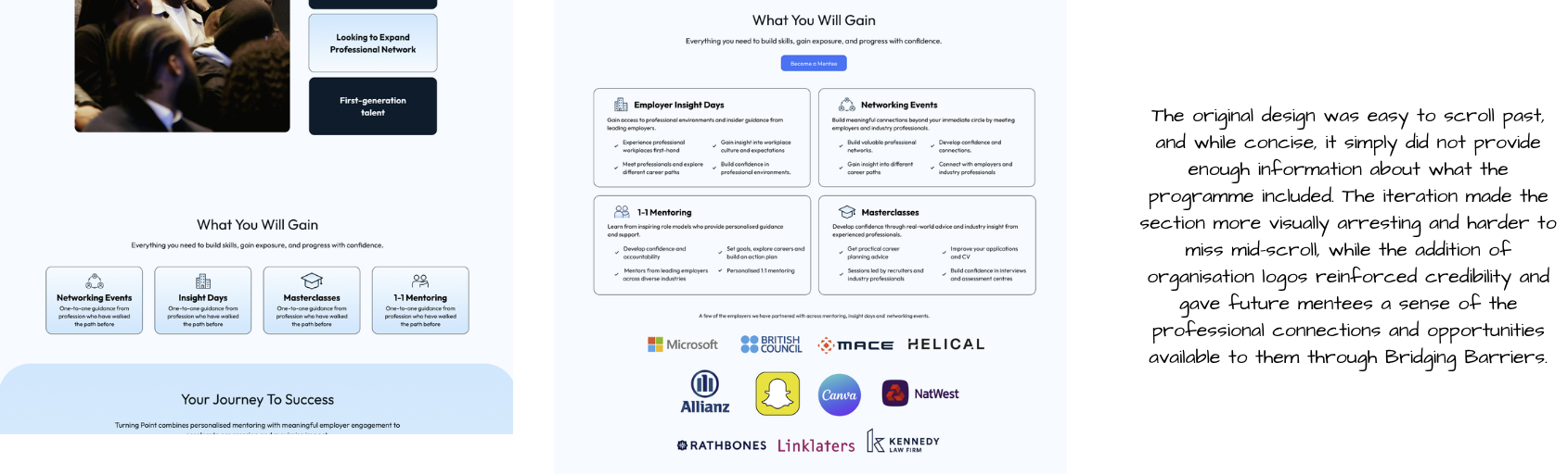
Iteration 4: Showing the Journey, Not Just the Process
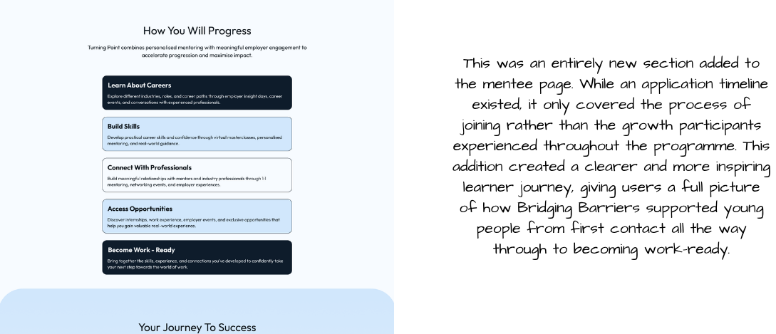
Deliver
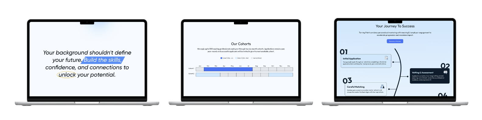
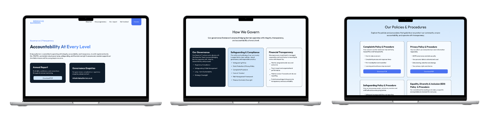
Final Prototype
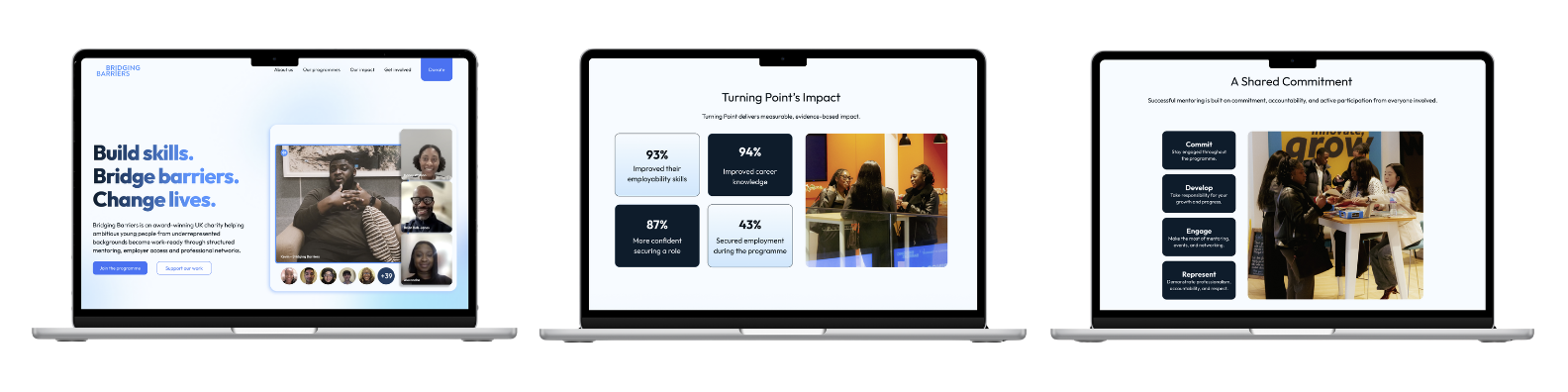
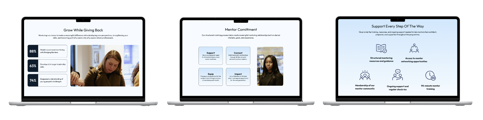
Below are the final designs for the Bridging Barriers website, a platform redesigned from the ground up to connect with mentees, mentors, and business partners in a way the previous site simply could not. Every page was shaped by research, stakeholder feedback, and a clear focus on trust, clarity, and conversion.
Reflection
Impact
The website redesign reduced friction across every audience journey, ensuring that mentees, mentors, and business partners could all find what they needed quickly and move forward with confidence. By strengthening credibility through clearer governance information, prominent employer logos, real testimonials, and impact stats, the website was repositioned as a platform that could actively drive results. With a more compelling and trust-led experience in place, the redesign has the potential to increase mentor sign ups, grow business partnerships, and encourage more donations by giving every visitor a clear and confident reason to get involved.
What I Would Do Differently
One of my biggest learning curves on this project was knowing when to involve developers. Early on, we would design first and then discover that certain ideas were not technically feasible, which sometimes meant going back to the drawing board. If I were to approach this project again, I would bring developers into the conversation much earlier, communicating the brief and my ideas at the start of the process rather than after key design decisions had already been made. Their perspective from the outset would have helped identify technical constraints earlier, leading to more informed design decisions and a much smoother handover overall.
Key Takeaways
This project gave me valuable experience working as part of a product team alongside a product manager, developers, and other designers, and reinforced how much stronger the output is when everyone is aligned and communicating well. It also deepened my experience of stakeholder communication, learning how to capture feedback from both the client and the wider team and effectively apply it in a way that directly shaped and strengthened design decisions. Keeping that dialogue open and consistent was key to ensuring the final product felt right for both the organisation and the people it serves.
View Next
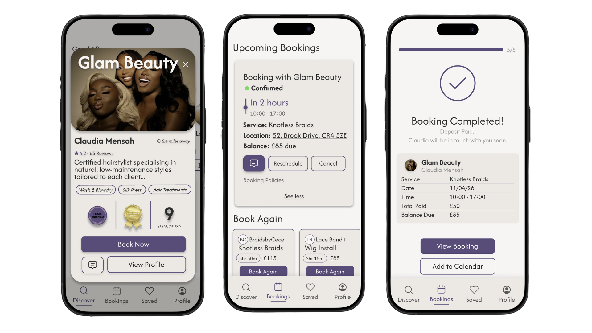
LUMA
Role: Product designer
Product: Luma is a beauty service booking platform designed to help clients confidently discover, evaluate, and book trusted service providers.
Impact: Reduced hesitation and anxiety while making online bookings and built users confidence across their booking journey.
Tools: Figma, Claude AI
Project Type: Conceptual Project
BeLingual
Role: Product designer
Product: BeLingual is a language learning platform designed to build speaking confidence through immersive practice and genuine community between students.
Impact: Improved language learning practices and grew the BeLingual community.
Tools: Figma
Project Type: Live Client Project